June approaches and with it comes the IMC.
To mark the occasion, we are profiling eleven of the greatest living practitioners of a distinctive tradition of art that lives at the meeting point of the gallery world and illustration. These artists all gathered to teach at the IMC last year, in 2018. They include the core faculty: Donato Giancola, Dan Dos Santos, Greg Manchess, Rebecca Leveille, Boris Vallejo, Julie Bell, and Scott Fischer, as well as visiting artists Tara McPherson, Kent Williams, Greg Ruth, and James Gurney. I have had an opportunity to get to know each of them because my wife, Rebecca Leveille, founded and directs the IMC. Thus I’ve gained insight into their ways of thinking through their lectures, demos, and hearing their technical conversations with students as well as being able to sit down and have some great conversations with each of them about their art.
Before diving into their work individually it only makes sense to define the subtle things that bind them together. The first outstanding thing is their use of traditional media such as oil, ink, and graphite. Many of them also work digitally (and digital artists are more that welcome at the IMC) but this group’s level of expertise with traditional media makes them stand out. They mix traditional painting and deep pop culture awareness. Another unifying thing is that they often exhibit at galleries, blurring the lines between fine art and illustration with shows in New York, Los Angeles, Paris, and Tokyo. The IMC has a strong focus on the particular skills of illustration but it is also a place where people feel free to expand into any direction they want with those tools of narrative figuration. Rebecca embodies this attitude in that she works exclusively for a fine art audience now.
The third tie between these artists is that they all have a tremendous depth of experience. They each have decades of knowledge of visual storytelling techniques that, in the past, only flourished in the world of illustration.
Given the wattage of the group it is striking how supportive the vibe is when the IMC gathers each year. People are there to work hard but It doesn’t feel like an art school. This may be because, in the past, artists working in this vein have often been the underdogs of the art world. It could also be because illustration is a collaborative thing. Or maybe its because the road to mastery of this particular skill set is long. The teachers are there to help the students out with whatever point in the journey they may be at, from novice to practicing professional.
Speaking of which, the program also includes visiting professional who help the students along their journey each year. This is a key part of the program. In 2018 these included core faculty member Irene Gallo of Tor Books, frequent guests Lauren Penepinto of Orbit Books, Marc Scheff of Everyday-Origininal and Lance Rehs of Rehs Contemporary Gallery.
This brings me to one last bit I need to say before diving into the art. This regards me personally. I will be one of those visiting professionals for IMC 2019, writing about select student work. The article will run here on the Beautiful Bizarre Magazine website. I am very much looking forward to meeting the next wave of artists who want to push the history of this image making tradition into new and exciting directions. Remarkably there are still some spots available for IMC this year, but enrollment is only open until May 10, so act quick if you want to come. I hope to see you there. Click here for more info.
The faculty for IMC 2019 will be: Mike Mignola, Karla Ortiz, Iain McCaig, Irene Gallo, Greg Manchess, Rebecca Leveille, Donato Giancola, Julie Bell, Scott Fischer, Boris Vallejo, and Dan Dos Santos.
Now to talk about the art…
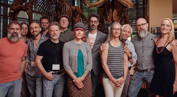
Photo by David Palumbo
Pictured here IMC faculty from 2018, left to right: Donato Giancola, Irene Gallo, Dan Dos Santos, Kent Williams, Greg Manchess, James Gurney, Tara McPherson, Greg Ruth, Julie Bell, Boris Vallejo, Scott Fischer, and Rebecca Leveille
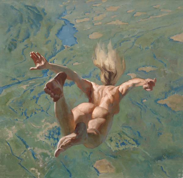
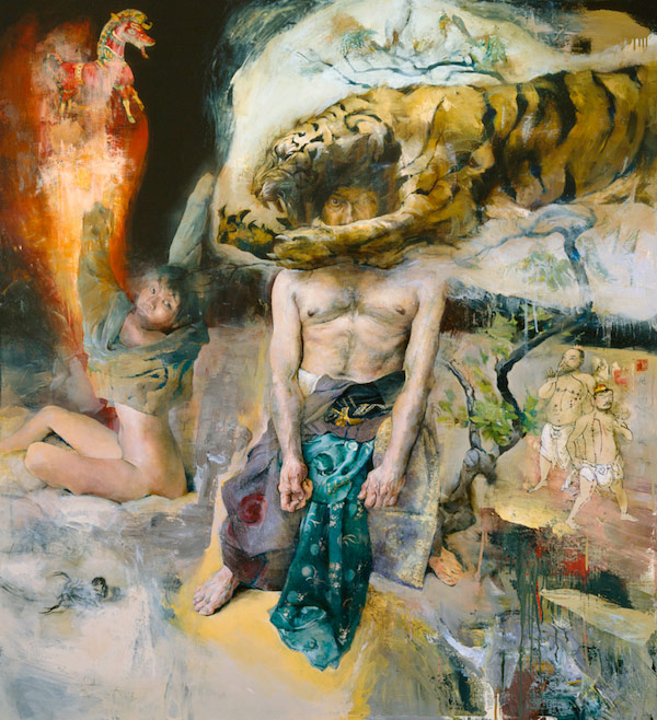
Donato Giancola
Donato has made a name for himself producing oil paintings that are epic in all kinds of ways. His dramatic approach has to lead to a slew of awards and recognitions as well as work for just about every venue an illustrator would want to work for. He is a great observer of art history and his scenes use many visual techniques that previous generations developed to tell the epic stories of their day.
His important early influences include the contemporary artists Vincent Desiderio and Gerome Witkin. Donato studied under Witkin in college and sought out Desiderio in order to work as his studio assistant later. Both of these older artists painted large scale multi-figure scenes. They were coming at it from a fine arts angle and this was different from Donato. He was committed to being an illustrator from the start. Even so he saw that Desidario had important things to offer. These included ways of thinking about color and light that could make a big dramatic painting hang together.
Donato also had an attraction to painting large. This wasn’t necessary for publishing, yet he wanted to do it anyway. Eventually a surprising chain of events conspired to push him over the threshold.
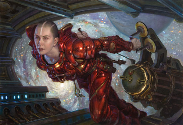
In the late 90’s the legendary gallerist Mary Boone teamed up with renowned sci-fi illustrator Vincent DiFate on the unlikely project of putting together a show of Sci-fi illustration at Boone’s blue chip Manhattan gallery. They invited Donato to take part.
This seemed like a once-in-a-lifetime opportunity so Donato pulled no punches and produced a tour de force astronaut painting about eight feet wide (2.4 meters).
However, when he brought it to the gallery they declined it. They said it was too big. He was left out in the cold.
This was not the end, though. DiFate managed to get the sci-fi show to travel to another location, the New York Hall of Sciences. He asked Donato to bring his big painting to be exhibited in that new venue. There the director of the museum fell in love with it. He requested to keep it a while. The astronauts ended up staying for seven years and were seen by an estimated 3.5 million people. The painting also inspired the United Nations to commission Donato for a series of stamps. It won awards and was featured on the cover Spectrum and on Asimov’s Science Fiction Magazine. It was displayed in Donato’s solo show at The Huntsville Museum of Art in Alabama. Finally it was purchased by Cathy and Arnie Fenner, two of the most esteemed genre art collectors. Needless to say Donato continues to work at whatever size he wants to.
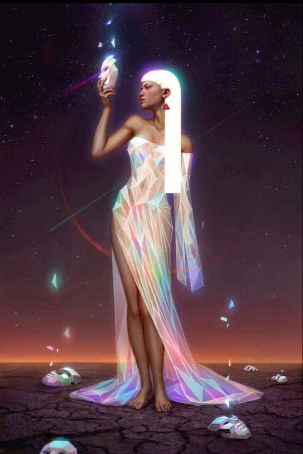
There are many ways of making an epic painting—as anyone could see just by looking at the artists featured in this group. Each different method creates a different look and feel. Sometimes the choices can be subtle, having a subliminal effect. Donato’s method for creating visual unity in his outrageous fictions is just this kind of thing.
After he has assembled a all of the photos and objects he wants to use for his work and after he has made a precise drawing of the work he applies color in a way that obeys theories and ideas of color as much as it follows any one thing he is looking at. The idea is that every object in his paintings has a temperature change from one side of it to the other. For example, if the lighted side of a face is painted with cool colors the shadow side is painted in warm colors. He does this to every single object in the work. Although this is not necessarily how the world looks the method has an effect that is seductive, it makes the viewer want to believe in the image.
To heighten these visuals Donato also makes sure there are a lot of complex shapes in each image. He throws in surface elements and details and objects so he can paint many instances of color that changes temperature. These things also create many alterations in light and shadow across his works. By thinking about things in this way he engineers a kind of rhythm to his paintings that shows his style in an abstract or theoretical way.
This divergence from straight observation is important to him but so is a love of nature. Looking at his fictional worlds always reveals treats like beautiful effects of rust, or twists of tree limb. These passages often seem more naturalistic and carefully done than they need to be. They are things he obviously delights in.
Donato’s use of abstract theories to create a sense of illusions can raise a wider question. Why is it that we sometimes need fiction in order to capture a deeper sense of reality?
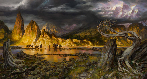
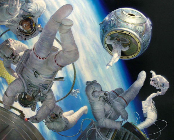
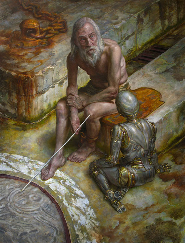
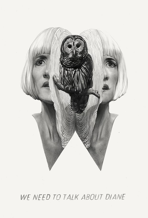
Images Below by Donato Giancola
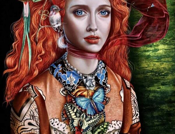
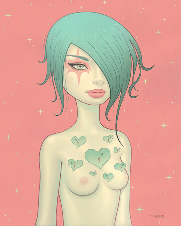
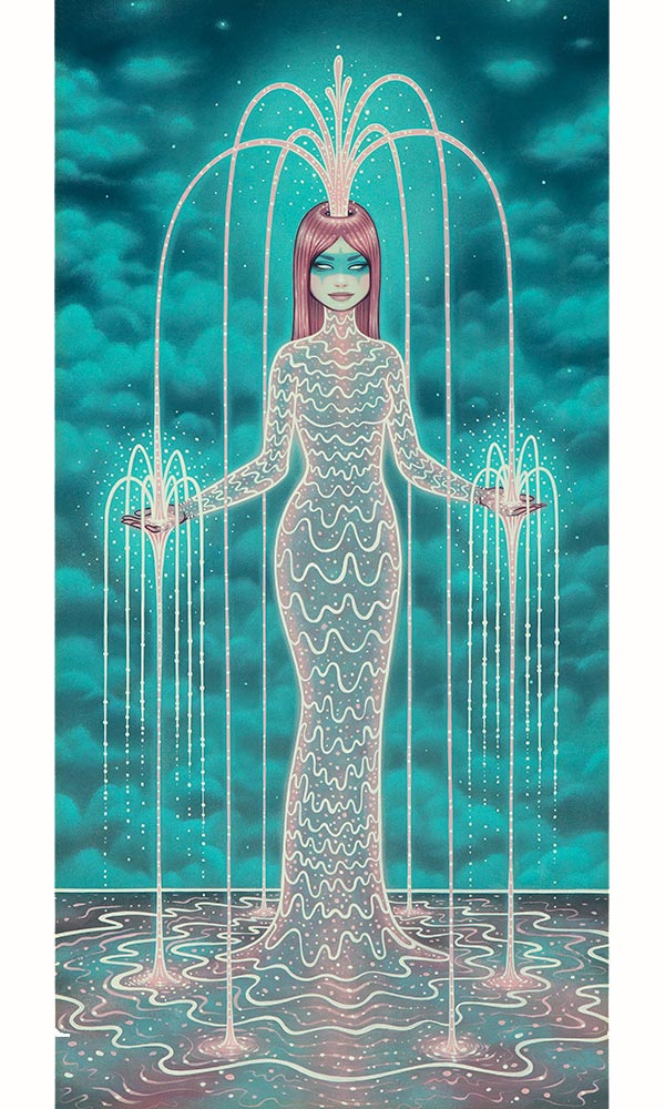
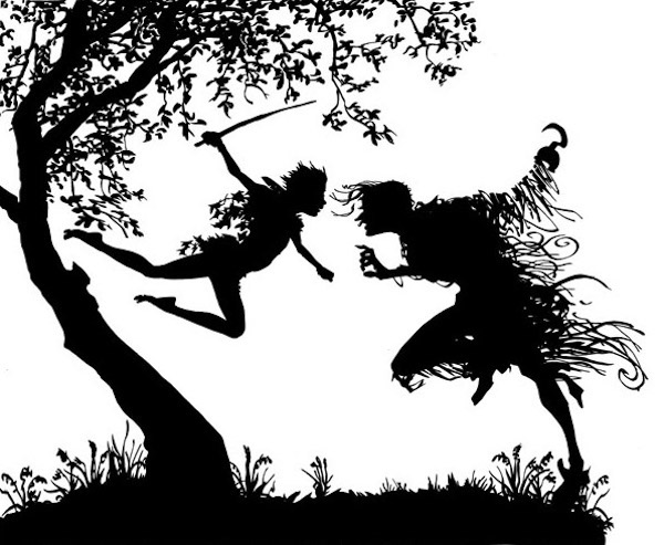
Tara McPherson
It is more than fitting that the foreword for Tara’s new Monograph is written by alt rock legend Kim Deal —a driving force behind the seminal bands The Breeders and Pixies. Tara’s art has always been deeply intertwined with music. She’s been declared “the crown princess of poster art” by Elle magazine and she has work in the permanent collection of the Rock and Roll Hall of Fame. But Tara is also punk rock on a deeper level. At the start of her career she did things that ended up bucking industry norms: she found a way to make her gig posters for shows without having to submit sketches to anyone thus holding onto the freedom to do create whatever imagery she wanted. This set her on a path of doing only images that she really wanted for a scene she loved. Since then she has expanded into the role of a more traditional illustrator with loads of high profile jobs behind her but she also continues to find new ways to make and sell her art her own terms.
Its worth going into how it was that Tara got her start with concert posters. In this story there might be clues for how an artist can keep their vision close to their heart. After art school in the 90’s she was playing bass in a Riot Grrrl influenced band called The New Detectives. She made posters for the band. With time they played in bigger venues with other groups and she started making posters that included them too. Then she took a leap and started doing posters for musicians she wasn’t performing with.
She worked it out so that the venue would ask her to do her poster and later she would ask the band if it was ok for her to come to the show and sell her posters at their merch table. A lot of the bands thought this was cool. Her career took off. Every part of the process was as inspirational as could be.
Given this history it is striking that Tara works mostly on oil paintings now. This is also surprising because her imagery has a graphic look that seems like it would be more easily done on a computer. Yet, while she does use Photoshop for some projects, much of her work is done in real space. She painstakingly paints images on panels in a contemplative process often taking a month to complete a piece.
She is very dedicated to this. Old school methods come into play as she lays in a base color then paints on top of it in another hue in such a way as to allow just enough of the underpainting come to through to make the surface color pop. Precision is primary as she carefully brushes in gradations and paints multiple slightly different colored outlines around objects to foster a sense of glow or of harmony. The paintings themselves are surprisingly tactile in how they are put together. The effect of internal illumination is enhanced through the placement of thicker dabs of paint that rise a little off the surface of the panel so that these points better catch the light.
The search for glow is an important theme running through Tara’s work. Unlike other artists in this group for whom a glow often refers to magic or electric light, Tara’s fascination with radiance comes from an appreciation of the natural mysteries of stars and bioluminescence. She has given serious thought to starlight. Before going to art school she pursued a degree in astronomy. The importance of bioluminescence is also rooted in personal experience. She tells of a life-altering revelation she had while swimming in the famously glowing waters of a bay in Puerto Rico.
She tells another story about her inspiration that is a tale of near mythic dimensions. When she was a child her father was a prop handler in Hollywood and one day he brought home the actual bracelets and golden lasso worn by Wonder Woman in the TV series. These things were Tara’s to play with. This particular influence has come out lately in Tara’s design of a Wonder Woman figurine, which won a prize at the 2018 Designer Toy Awards.
For artists that inspire her she names a wide ranging group from traditional woodcut master Yoshitoshi to contemporaries Junko Mizuno, Katsuya Terada, and Yasoshi Nirasawa. She also expresses a deep appreciation for classical Italian artists Botticelli and Bronzino. Additionally she talks of her time interning in Hollywood working on the show Futurama.
It seems particularly important that Tara’s work be as self motivated as possible. Her compositions involve rearranging easy to read symbols. These become like words that she re-combines in unexpected ways to make a poem. While all art can be seen as visual poetry Tara’s work distills this idea to an essence. However straightforward her symbols may appear they have meanings that are impossible to define.
More on Tara McPherson in Beautiful Bizarre
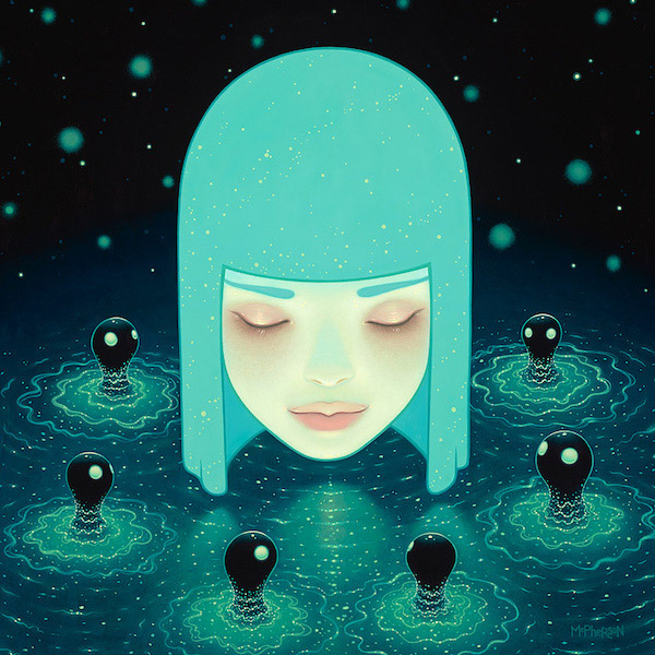
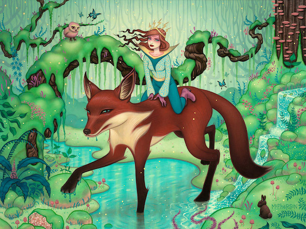
Images Below by Tara McPherson

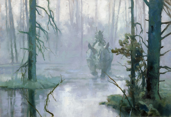
Greg Manchess
Watching Greg Manchess apply paint to canvas it is abundantly clear that the actions of his hand are the culmination of a long path. His originals contain obsessively precise color. More surprisingly they also show a definite texture as he uses gently loaded strokes of buttery paint to convey a specific movement with every touch of the brush to canvas. His palette knife also comes into play regularly, bringing its ability to deposit globs or make flat ragged-edged or chopping marks.
This attention to the material of paint was originally inspired by Greg’s observation of the paintings of golden age illustrators like N. C. Wyeth and Howard Pyle who used a lot of texture. Later he came across the lesser known work of Frank Duveneck. Duveneck is another artist of the same era but he is even more precisely oriented towards incorporating the drag of the the brush as a primary characteristic in representing the figure.
For all his technical virtuosity Greg is not one to talk about artistic talent. Instead he regularly promotes the belief that it takes ten thousand hours of work to master anything. This is an idea that comes out of the research of the psychologist K. Anders Ericsson and it was later popularized by Malcom Gladwell. It makes Greg a patient teacher, but it is also an interesting idea to think of in terms of his work.
His career stretches back past forty years as a freelancer. It began in a very different place than he is now, in an institution largely, if not totally, vanished from America. He cut his teeth at an illustration firm in Cedar Rapids Iowa in the 1970’s. Although this company did take on high profile national jobs, the bread and butter of the place was the now mostly obsolete gig where a small or midsize business would commission hand-drawn ads to circulate in small run papers and magazines. The juniors in the firm would bust out the industry workhorse of the time, the Fairburn System of Visual Reference, to grab a photo of a pose. They would then trace it to crank out an image of a dapper dude with a smoke and a stylish set of wheels.
In the time since that training ground he has used his work to steadily hone in on the rather different vision of the golden age master. In the last couple decades he has executed work for a huge array of clients including wonderfully classic feeling pulp covers for Hard Case Crime novels, postage stamps, and National Geographic covers. This has culminated recently with a large museum show of work from his fully painted book “Above the Timberline” at the Norman Rockwell Museum and some one person gallery exhibitions. In this upcoming year his Paris gallery, Galerie Daniel Maghen, will host a second show of his work.
For his gallery exhibitions he makes work that he views as one panel from an unknown story. The French audience seems very enthusiastic about this approach. Maybe this is due to history. The European fine art community has always been more appreciative of American illustration than the U.S. art world has. A fun example of this is some comments and attitudes of Van Gogh. In his letters he expressed deep admiration for the work of American illustrators like Howard Pyle. Van Gogh even attempted to become an illustrator.
While it may be nothing new for an artist, particularly an illustrator, to be fascinated by those golden age greats Greg contributes new elements to the tradition. He picks up on the earlier painter’s sense of the importance of thicker paint but he uses it in a different way. He employs brushwork and color in a way that reaches a kind of height of paradox: it seems at the same time to be completely free and loose and tremendously calculated.
Images Below by Greg Manchess

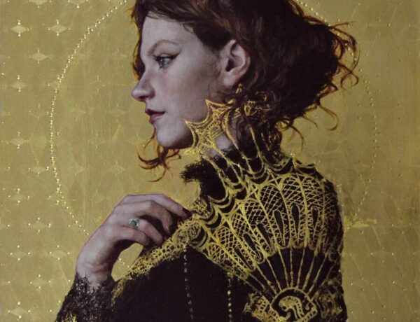
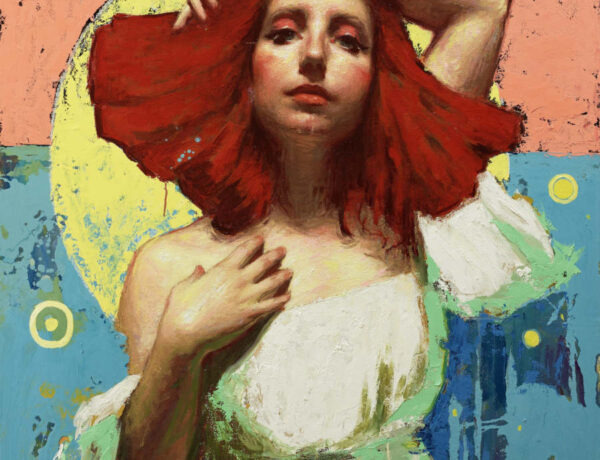
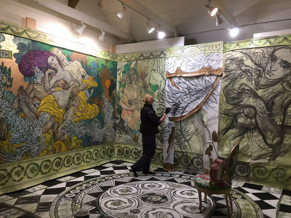
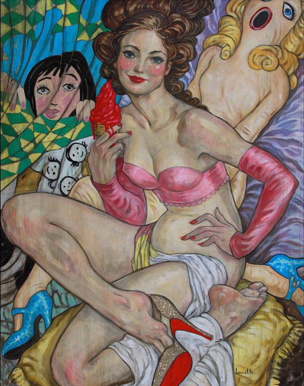
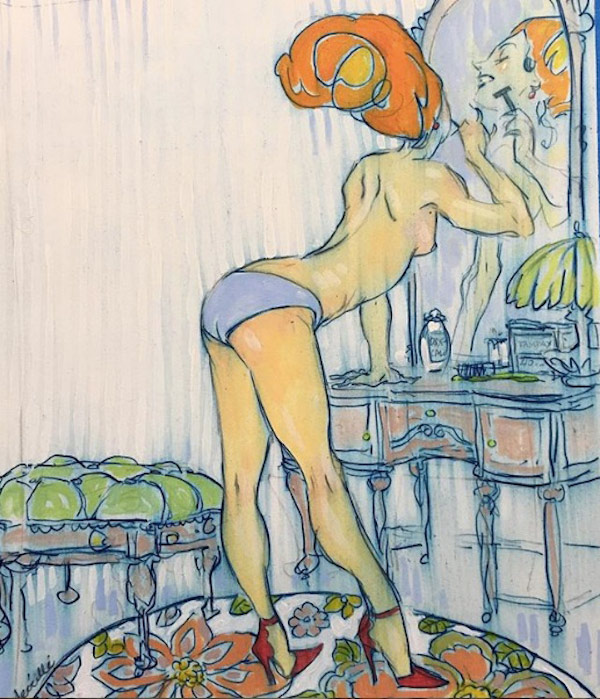
Rebecca Leveille
Rebecca’s art is not only done with traditional materials but has also come to wrestle more and more with the ideas of the contemporary art gallery and the history of modern art. Recently this has resulted in her creating paintings which push into three dimensions to become something like sculpture or installation art. Her next exhibition at the Michelson Gallery this spring (coinciding with the IMC) will present an entire painted chamber. False walls made of canvas panels will mimic architectural elements and explore the psychology of a room itself. The work delves into how a person’s idea of a space gets entangled with their interior world and emotional life.
Despite her current artistic ambitions she did not start out by thinking of the gallery world. Instead, like many artists of prior generations, she went into illustration because it looked like the only place where an artist could do explore working with representational figures. After college she did have an abundant career in illustration, partly due to the fact that within that field she was still able to drive forward her particular obsessions as an artist. These compulsions could be described as a fascination with the nature of line, gesture, and drama.
In transitioning to fine art she has felt unchained. She is now free to explore her vision in whatever way she pleases because she has left behind the collaborative relationships of illustration and all its considerations of audience. Of course in doing this she has also apparently taken the risk of having a lot less people interested in her work. However I wonder if this will be true in the end. I believe most striving fine artists have an ambition to someday change art history. If that can be achieved then the artist may gain a cultural impact as great as illustration.
I have been so close to Rebecca for so long that it’s difficult to select what part of her work to talk about, but being forced to choose I choose line. Rebecca has a special relationship to this deceptively simple thing. She will use fields of color but often even these are created with a series of assertive fat lines of paint.
In Rebecca’s work line is tied inextricably to gesture. Gesture is the stylized movement of her hand as she works and it is also the sense of character that she bestows on the people and objects in her imagery. It is the main direction of thrust of a body or the sense of soaring movement to a bunch of tree branches, the humble squatting presence of a group of rocks. In Rebecca’s world everything has a personality that is shown when she reduces it to a linear shape that has some distinctive trait.
This thinking influences her way of composing an image. The entire picture must have its own sense of character created by its internal flow of lines and shapes. Establishing this cadence is the first order of business, it is the root of all her images. After putting down this larger idea of mood through interwoven abstract forms within the picture plane she develops the smaller movements and shapes of characterful things to contribute to the preordained swings of the composition.
Her arrangements are much more organic than geometric. Lines don’t chop, fray, or scratch. They glide with precision. They undulate and sway. No matter the subject, they will take elegant turns. This sensibility can be deployed to create cognitive dissonance when her work takes on a brutal subject such as sexual assault. Other times this language of line comes across as especially harmonious when applied to images of female power and representations of a woman’s desire.
The key to Rebecca’s vision is that it is firmly rooted in her imagination. The gestural line is an interpretation of reality. When making an image, even a multi-figure painting, she often doesn’t use any photos to base the image off of. This is unusual because her figures are real enough looking that they can convey specific and sensitive body language. It may be that this habit of drawing people from imagination represents the farthest reaches of her specific way of thinking.
She constructs her figures in a way that’s not grounded in fixed ideas about anatomy. She also doesn’t base her bodies on the commonly taught technique of declaring arms and legs are like cylinders that you can reposition and draw in perspective. Instead she focuses on varying the way she puts down lines. The aim is to create a convincingly natural graphic language. She sets up a plausible seeming rhythm of curves vs. flats, long marks vs. short marks, major fat drags vs. minor light touches. If an artist learns anatomy in this way they can make lively figures from thin air.
Seeing lines inevitably make people think about movement. When someone looks at a line drawn by an artist they are taking in evidence of the passage of that artist’s hand through space. This kind of structured physical motion is important to Rebecca not only as an artist but as a dancer. She has studied ballet for years. These two different ideas seem to be reflected somehow in the way she is putting together her big installation of a room for her upcoming show. Standing in the middle of this artwork, surrounded by this sensation of human gesture I have felt as if I am somehow inside a dance.
Images Below by Rebecca Leveille

Greg Ruth
That Greg Ruth works with traditional media as his base may be the hardest thing to believe about the artists featured in this article. Partly this is because he has done something unusual for someone working in pencil on paper he has largely left the idea of making lines behind. This has the effect of producing images that look particularly smooth and photographic when reproduced. In addition it is hard to believe his drawings all start out being made by hand because he does sometimes go into them later with digital color. He obviously has nothing against computers. Yet his bafflingly precise drawings all do start out with the simplest of tools and his black and white work is completed without any digital interventions at all. It’s kind of ironic that he isn’t actually trying to perform Luddite magic where a primitive thing out-competes advanced software. It’s just that he finds pencil on paper faster and better. As a bonus drawing by hand also makes an intriguing physical object in real space.
In truth I was a skeptic. Even after I had a taken a few quick looks at his originals I assumed he was using Photoshop. Why would he not? There would be no shame in it. I thought he must be doing something like making photo collages digitally, moving things around to get the perfect composition and then printing them out super lightly so he could work on top. If I was making his images that’s what I would do. But he said he didn’t really do any of that. So when I visited his studio I pressed him hard on all of these questions.
By the time I left I was a believer. It came clear both that he was working by hand and that this was best for him.
In order to understand this it is important to take a look at his past. He has spent years developing very specific skills while executing a wide array of projects from a mural at Grand Central Station in New York to several children’s books to a video for Prince. But most importantly his body of work spanning two and a half decades includes a bunch of graphic novels.
Producing a graphic novel is an immense undertaking. Greg’s approach has been particularly risky. For his first one he created more than 100 sequential storytelling pages using only ballpoint pen. Additionally he did it without writing a script or doing any under drawings or preliminary sketches. He didn’t know that this was an absurd thing to do because he never studied illustration. He also didn’t know any illustrators when he embarked.
After he started learning more however, he still worked in a way that would seem a bit eccentric. Deciding ballpoint was too difficult he switched to an almost equally unforgiving tool, sumi ink applied with a brush. With these simple instruments he threw down many years of abundant imagery, including hundreds of comic’s pages. The unusual thing was that he continued to refuse to do sketches or preliminary drawings. Multitudes of pages involving characters interacting and things like realistic representations of forests and horses would come directly off of his brush with no graphite laid down prior.
It was only in the last couple years that he has turned to the pencil, a tool at once even more basic and radically more forgiving. The first project he did in this new medium is informative. It set him on a course of thinking in terms of photographic effects and lightly applied fades of grey. His concept was to render all the actors who had played Doctor Who while experimenting with the camera-based idea of the depth of field. For this series of 13 Doctors the earliest character was rendered entirely out of focus. The next was shown with a slight patch rendered in high detail with the rest fuzzed out. The images progressed in this fashion until the Doctor of the present day was shown in total clarity. Thus for the first face he drew no lines or hard edges at all. It and most of the rest of the series was an experiment in light but precise dabs of graphite. This new obsession of with gentle fades between grays, black, and white that continues to give his drawings a photographic feel.
Greg hates to have an image figured out too much before diving into it. The proof of this is his hundreds of pages of graphic novels. That aversion is the real reason he has no use for making Photoshop collages. Just to make erase all doubt in his technique I closely examined a couple drawings. They bear no trace of having visited a printer no single pixel or mark. They also show lots of evidence of the human hand, the dent of a pencil tip, little smudges, changes in shine between the different types of graphite. Finally, and most persuasively, the drawings all have little deviations from camera-like precision. These make it feel as if they were done by a super experienced draftsman working freehand from photo reference. They disappear when the drawing is photographed and reproduced small.
With questions of his technique out of the way the question remains of why he would do this. The short answer could be that he loves to work with his hands. Another answer has to do with his admiration of another art form executed through simplest means. The short story. At an impressionable age he read a piece by Ray Bradbury that was just a few pages long. For a long time afterwards he marveled at how simple symbols on a page created an entire world in his mind. Thus he has striven to find a way to do the same thing, to provoke an emotional response in the most massive audience through the most accessible tools.
He can use his pencil to pull on the strings of communal awareness, elegant arrangements triggering memories of shared drama.
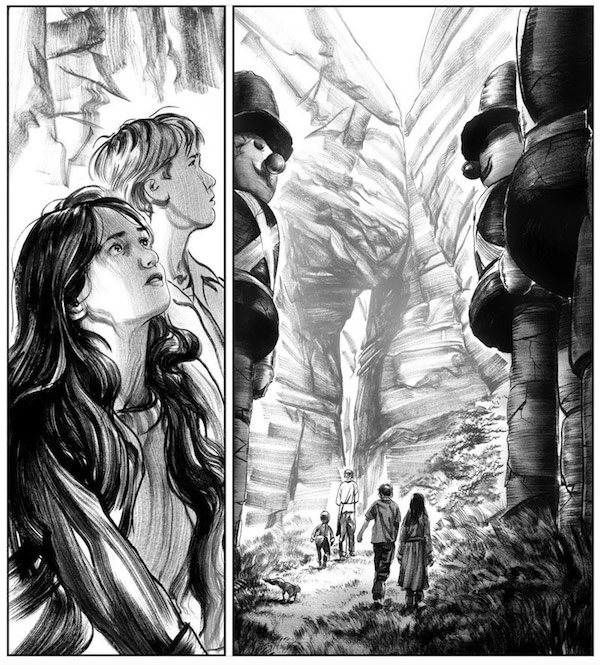
Images Below by Greg Ruth
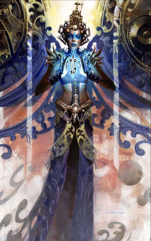
Scott Fischer
Scott Fischer is a relentless explorer. A lot of illustrators and artists work in a wide variety of ways but Scott has taken this a long ways. His methods range from digital, to oil on copper, to enamel on Mylar, to different ways of using stencils and rollers, to entire books drawn in ball point pen on lined notebook paper. But it’s not just the materials that vary. His clients have a notably wide variety as well. Within just the last few years they have ranged from NYT bestselling book covers, to cartoon-style books for young readers, to magic cards, to concept design for video games, to museum wall graphics for an internationally touring exhibition on Ancient Greece. Given Scott’s medium and audience-hopping vision it makes sense that he is also exploring the possibility of producing an animated series. He has a project now in development at Cartoon Network.
Some common threads do run through all of his imagery regardless of technique or audience. In his work there is a divergence from observed reality through distortions and patterns. Often he incorporates smooth vector-like lines into both figure and background to give snap or show motion. By contrast he also tends to chop and rearrange different elements of a picture into elaborately interlocking shapes. He squeezes and expands figures into graphics that sometimes alternate sharply between being flat silhouettes and being painted in the round. This can reach a height of mystery where a character and its surroundings become enmeshed enigmatically enough that they only slowly reveal symbols as the viewer spends time with them.
For illustration his influences in the last few years have been a group of artists who mostly got famous in the 60’s. Their work fittingly includes a lot of experimentation with making textures and patterns as well as bold cut out compositions. The artists includes: Lynn Buckham, Andy Virgil, Herb Tauss, Coby Whitmore, and Bernie Fuchs.
For Scott’s personally motivated visual art he has taken up a characteristically provocative technical approach. Using a copper plate as a base to work on, he interweaves two elements: imagery painted in oil and a drawing engraved into the metal. The grooves in the copper make it so that the piece shines in a different way depending on the where the viewer is standing. Thus, like sculpture, the painting becomes impossible to completely understand from one angle. Instead the total impression of the piece must be held in memory.
In a completely separate vein, his paintings on Mylar now represent another trademark technique. Mylar’s translucent surface allows for line and color to be applied on both sides, kind of like painting on glass. The color or line that’s put on the back shows through to the front in an intriguingly muted way. This process encourages that alternation between flat graphics and dimensional illusion that Scott favors. Many of his more baffling compositional riddles are painted on this material.
Aside from new techniques triggering new ways of solving problems it seems that there is also a certain amount of adrenaline fueling Scott’s explorations. He has made many of his bigger discoveries when, in the 11th hour of an assignment, he asked the question “What if I try doing this in an entirely new way?” It is uncanny how often this works out to his advantage.
Scott’s quest for new alchemies of picture-making leads to a balance in his work that is like the tension between the individual and society. Given how experienced he is now, his explorations are essentially guaranteed to come out. Yet they still play with an edge of chaos that contrasts with the collaborative needs of illustration, a field that is inherently trying to stir a known effect in a large audience.
Images Below by Scott Fischer

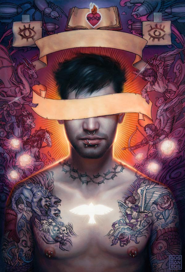
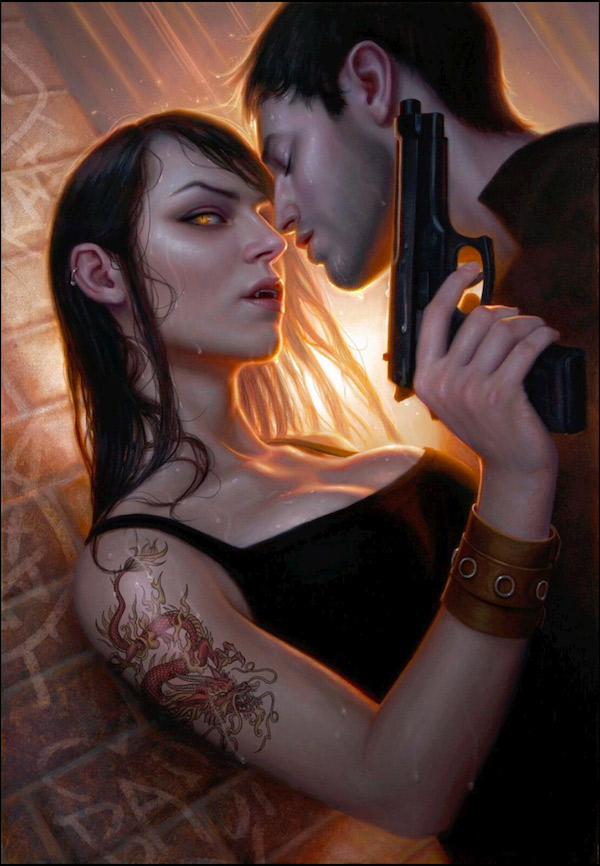
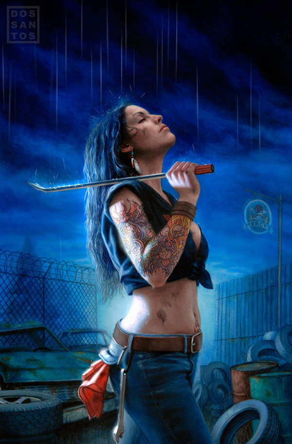
Dan Dos Santos
Dan Dos Santos is on a mission to capture–in oil paint–the experience of watching TV. In this pursuit he is absolutely committed to illustration. In fact his love of pop culture is in contrast to some negative experiences he had at an early age with financial success selling art in a gallery. This may seem like kind of an ironic story.
Around the time he was going to art school, he needed to turn a buck somehow. He looked at what was selling at a gallery in the well-to-do part of his Connecticut hometown. To suit their interests he cranked out a series of ballerina paintings. They flew off the walls. Calculating his income he figured it came to be hundreds or thousands of dollars per hour. The gallery kept asking for more.
However it didn’t take long for him to feel hollow inside. He found he just couldn’t do it. He reconsidered what he loved in life and made the decision to go back to his true love of illustration, even though this meant taking a risk with his finances. But after making this choice he felt unchained as he allowed himself to go towards the things he loved.
This affection paid off as his career eventually caught fire, stoked by the success of his award winning Mercy Thompson book covers. Currently Dan is enjoying a well established career with–among other things–loads of New York Times Bestseller titles behind him. More importantly he feels free. He recounts times when he finds himself chuckling with deep enjoyment in the wee hours of the night as he paints such things such as explosions with cars and alligators flying through the air.
Dan has tremendous skills with digital media and the clients he works for don’t really care if he works digitally or traditionally. Yet he is drawn to handmade techniques and executes the vast majority of his work as paintings. Even the light effects that seem digital are actually painted in in a baffling way. Attraction to glow effects is a common thread between a few of the other artists in this group: Tara, Scott, and Donato. For Dan, though, the desire for this glow is partly rooted in the mission he has of painting images that are like TV.
He is especially into in the look of TV programming from the era of his youth, the 80’s and 90’s. In order to capture that era he focuses on the type of production lighting that was popular then. He describes this as a parallel quest to that of the impressionists who wanted to capture the new technologies of lighting for their era. For them it was gas light in the theaters and cafes of Paris. For Dan it is the style of arrangements of primary and secondary source illumination and the equipment of stands, gels, and spots that were popular in entertainment in the last part of the 20th century.
It is not unusual for an illustrator to set up specifically lighted photo sessions with models. An artist can use this kind of thing as subtle way to convey style. On this note one of the things that Dan uses a lot is a technique known as rim light. This involves a powerful spot shining from the behind the subject. It makes them stand out from the background and often creates a glow as brightness shines through things like clothing, hair, or foliage.
Even with his dedication to the shoot Dan regards the resulting photo as only a visual aid. It must be interpreted to meet the needs of the art, the idea that he had before snapping it. When later working from the photo he alters shapes and changes light as needed to best tell the story and make the painted image.
Prior to any photography, he carefully decides how the lights and darks and colors will be organized to work together in the final composition. He breaks things down into a triadic arrangement: foreground, middle ground and background. The temperature of the color is alternated in the different layers so that there is contrast. A warm foreground means that the middle ground will be cooler and the background will likely be a little warmer again. Likewise he organizes tonal arrangements so that each section has a basic unity of lightness or darkness. For example the foreground may be dark, the mid ground mid tone, and the background light. His methodical thinking has even lead him to produce a handy diagram showing all the possible arrangements of light and dark in a basic portrait composition if an artist has three tones to work with. This is posted on Muddy Colors, an on line artist’s community he established
It is typical of Dan that he would found an online collective like Muddy Colors. He is a community builder and he was instrumental in forging stronger connections between all the artists who have become core faculty of the IMC. His early artistic influences also have a social aspect. When in art school he was friends with the greatly talented artists James Jean and Tomar Hanuka. They would each push each other to excel. Another influence was Steve Stroud, former president of the Society of Illustrators, who he interned with in high school and who he later established a studio with.
But going back to his earliest experiences may be most illuminating of all. One important story he tells is about how, when he was young, he felt driven to draw UPC labels on his artwork in order to make his pictures look real–like products. Another important childhood story is one he tells about the experience of spending time emulating his sister. They would sit together and draw in front of the screen.
Dan’s quest to recreate the experience of watching TV seems to be in part about that bond people get absorbing pop culture together. He has also described the act of drawing or painting as a process of thinking deeply about the subject. Thus his work could be seen as a thoughtful immersion into the pop culture that envelopes us all.
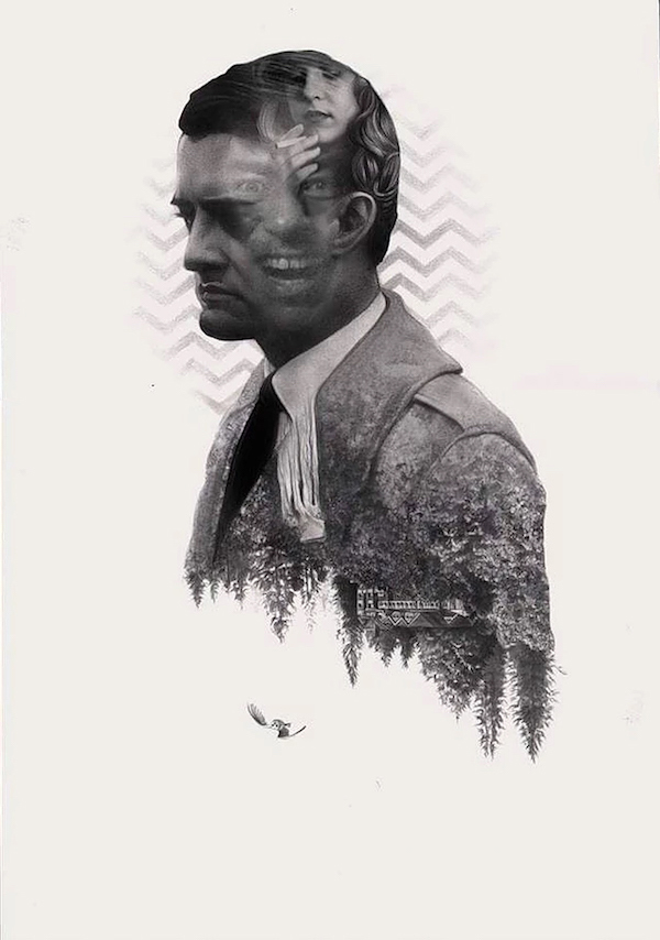
Images Below by Dan Dos Santos
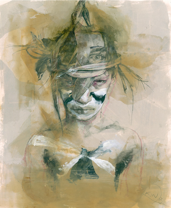
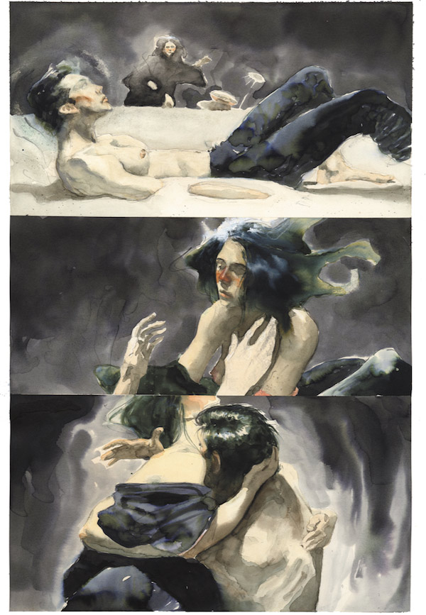
Kent Williams
“I should go to more figure drawing sessions”, I heard three people say this at the IMC 2018 after they absorbed Kent William’s work. He inspires this response because his art dives deep into the psychology and physical sensations of drawing another person’s body while the artist is right there with them. There is a certain urgency and expressiveness to his way of making marks that makes them appear to drawn from life–as they almost always are now. But this was true even when he started out and worked from photos. His earliest published work shows this. The panels for his fully painted graphic novel “Blood” (which, astoundingly, he produced while still in art school) look as if they were created with the brevity and purpose of an experienced painter who only had moments to catch a scene.
Now, more than three decades later that urgent sense of the figure remains the same even if his way of presenting it has gone through substantial changes. He still takes on illustration occasionally, and he has had a personal project of a graphic novel in progress for years, but the vast majority of his current work finds its audience in the art gallery.
To create his paintings he first sets up a drawing session. He usually gets close to his model for the reason that he wants to depict people at a conversational distance. When someone is that close an artist can’t see their body all at once. Recording the visual reality of the experience requires the artist to work with some distortions, bending the picture plane. Kent points out that this means every drawing of figure that isn’t distorted is one that must be made at a distance. He believes figures rendered in perfect proportion end up feeling like they are always at a remove from the viewer no matter how close they may get to the image.
Drawing from life that near to the subject, however, must introduce a real interpersonal tension. Kent’s drawings are often full of a fierce line work. It is hard to picture the model being able to relax much when they are right there next to his intense attention.
Kent uses signature styles of poses and gestures through his entire body of work. It is a way of thinking about the body that seems to harken back to the German Expressionists, particularly Egon Scheile. Kent apparently acknowledges the influence. In one of his recent paintings he includes an image of a drawing by that early twentieth century master. Part of this shared vision of the body is that the hands of the figures are decidedly wrought. They dramatically grasp, clutch, or ball into fists. Maybe this is a parallel to the impassioned hands of the artist as they are fighting to capture the appearance of the other human through their own movement.
After the drawing session Kent selects one of his depictions to enlarge by projecting it onto canvas. When he blows up the drawing he never copies it in a senselessly obedient way. He always alters it to suit the the larger composition. Then he applies paint in a manner that further plays with the drawing. Fat strokes might cut into it as he lays down assertive colors. This part of the process of the painting shows the movement of the brush. It is a kind of mark making that is very active feeling, like his drawing. It invites the viewer to ponder what it must feel like to be the artist pushing the paint around.
But then Kent adds a technique that complicates this. He lays on opaque glazes that simultaneously make wonderful illusions and render the construction of the image much more of an enigma. This is an audacious moment in the creation of the picture. It involves spreading thin paint over part of the work so that it is basically obliterated. Then the artist wipes away paint selectively until the image emerges again to the desired degree. The result can then be partially painted on top of again to create all kinds of mysterious effects. When Kent brings these layers onto his paintings that are full of gestural marks he pulls and pushes things so that one part of a picture will seem to obey one set of rules for illusion while other parts are made in completely different ways. It can appear as if the same scene and body are being seen simultaneously through several different states of awareness.
Every art school continues the ancient practice of figure drawing. The prospect of trying to visually understand a living body that is occupying the same space as the artist is enduringly magnetic. Yet there can be alienation in this set up. Artists who focus on the figure session as their subject tend to end up getting into a misanthropic state of mind. Lucien Freud and Philip Pearlstein are two of the most famous examples of this. Kent isn’t like those guys in that he doesn’t limit himself to only rendering what is in front of him. Though he is clearly based in figure drawing he also includes allegorical symbols and plays with space. Even so there is some strain of mood that could be seen to run between all of three of these artist’s work. It seems to have something to do with the potential coolness of observing the human body as one thing among the world of objects.
To some artists the process of drawing a thing can render that thing captivating, whatever it may be. This seems to be true for Kent in that banal details of a scene often become major compositional elements. An extension cord running through the studio can play just as big a role as anything else. While being thrilled by everything can seem like a positive thing it can have a dark side, just as the figure session does. It could be that, if all things are fascinating, then nothing is fascinating. Euphoric nihilism.
Kent’s work is loaded with conflicting realities. A sense of physical closeness combines with one of clinical distance. Illusionistic space refuses to obey any one set of rules. Bold tactile brushwork dissolves under the influence of thin glazes.
Though his images are based on something so apparently straightforward as representational drawing sessions, his work as a whole could be taken as a declarations that the heart of lived experience and of human relations can never be contained by one way of seeing.
More on Kent Williams in Beautiful Bizarre
Images Below by Kent Williams

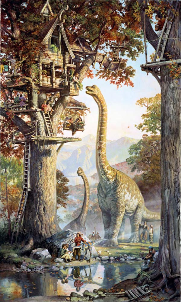
James Gurney
James Gurney’s Dinotopia books propelled him to fame in the 90’s making him as much of a household name as any illustrator of his generation. Tellingly the books were based in part on assignments he had done for National Geographic where he painted from reconstructions of ancient civilizations.
For James photos and imagination do not do the trick for conjuring forth an image. He is a builder of models, maquettes, and figurines which he lights precisely. He arranges these miniature elements and their illuminations into carefully staged storytelling compositions. He works things out meticulously with preliminary sketches with the aim of creating a solid classical feel. Often, to this end, he purposefully mixes arched or curved elements with flat straight lines. While his fictions have an epic feel their imaginary nature is offset by a mood that’s like a scientific or historical picture. They are seen in a level and evenhanded way. The viewer is never placed at an angle that could be disorienting.
In James’ work there are no dark corners that could harbor ideas of evil or superstition. You can look into every surface texture of these fulsome realities. They are all rendered lovingly, conveying a sense of deep dedication to their existence.
Because he works from lighted models in real space he is able to convincingly pursue the study of light, which is an obsession for him. In fact he seems able to successfully use touches of impressionistic techniques in his work in a convincing way because he is surely just as obsessed with the phenomena of illumination as any impressionist ever was.
Yet with James this effect is often put to the service of making a greater game out of playing with the imagination. In his paintings the scene is a fable but the light is real.
Unlike most people who work in imagined worlds James also wields his entire environments in a naturalistic way. Architecture is fairly plausible, plants are meant to be plants, the weather is just the weather. Each of these things might make you feel a certain way but its not because they have some mentality or motive of their own. For example, in James’ work tree branches will not swell and writhe around a figure as some subconscious manifestation of burgeoning desire.
His rational vision is undoubtedly influenced by his past. He has a degree in anthropology. In recent years this scientific part of his personality has also come to the fore with his focus on the study of the biology of seeing. For his books about perception and artist’s techniques he has gone so far as to work with researchers to track people’s eye movements when viewing paintings. This work provokes whole new questions about how compositions can be made and centers of interest established.
As another manifestation of his interest in light, art, and science he now carries around a sketchbook religiously. It brims with page-sized uncannily naturalistic depictions created from life as he engages in a perpetual practice of plein air painting.
Even when James was working primarily on fictional imagery his work was centered on something other than human drama. Instead it seemed he was taking up an unusual course in contemporary illustration. He was primarily creating a world to marvel at.
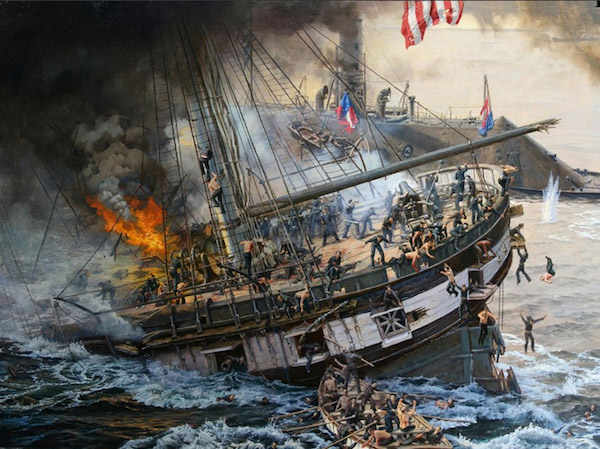
This thread of an inherently fascinating natural world has run through all of his work. When depicting the terror of a historical sea battle he showed it within a sea with entirely benign and beautiful colors and eddies, a thing that would bear no malice. A paradox of his artistic vision is that as a maker of fictions he seems to be striving to get closer to the essence of the real world and its real wonders. It seems the appreciation of these miracles would only be dimmed by dwelling on such things as the dark psychological dramas that are so often at the core of myth.
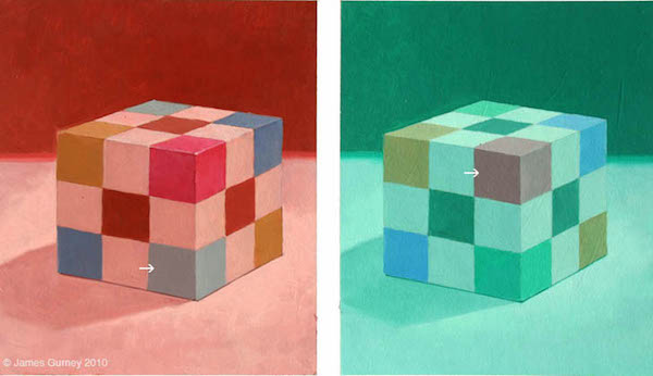
Jame Gurney: The Green Square is the Exact Same Color as the Red Square
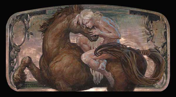
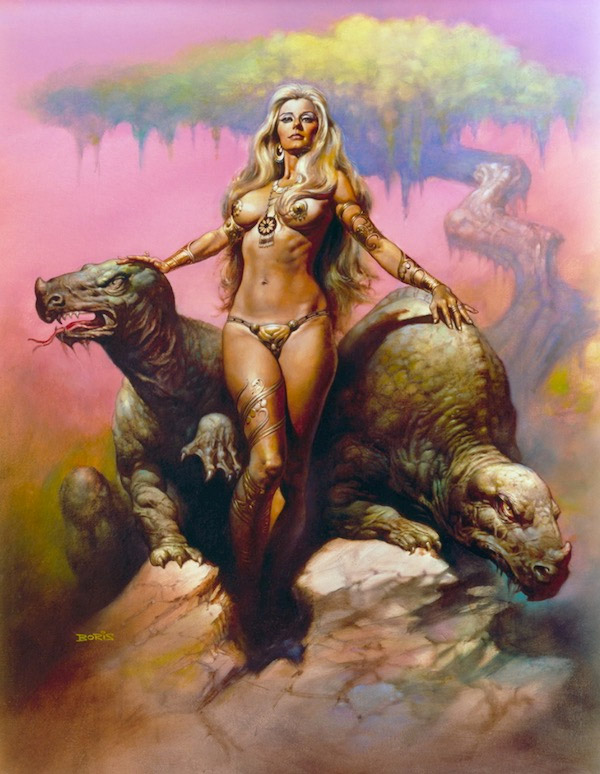
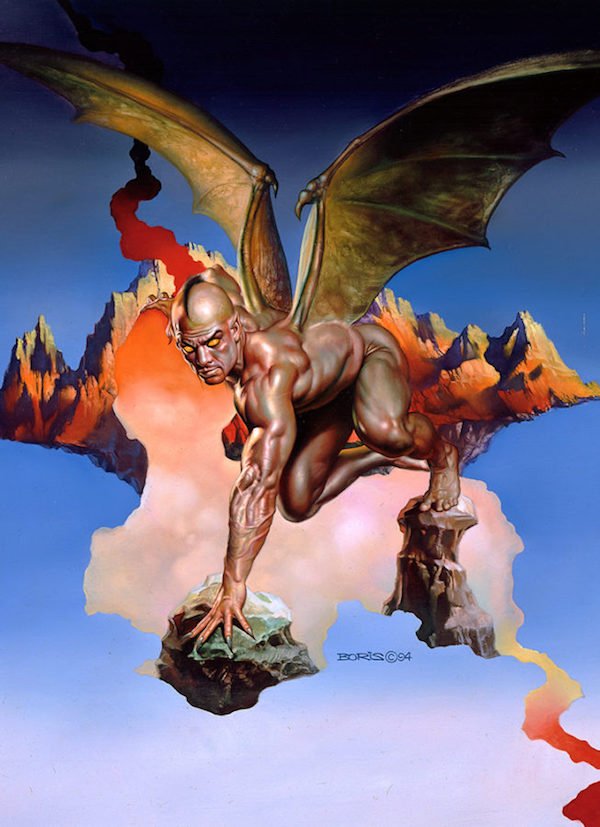
Boris Vallejo
Boris is a legend of American book cover art. He started his career in the 60’s and his work helped propel the rise of fantasy imagery for decades.
Most of the nuts and bolts of his working method are straightforward. He develops a sketch, hires an invariably sexy model, and takes photos at a professional level studio. Around the time he met Julie Bell his models started becoming more muscular. Indeed Julie, who had been a nationally competing weightlifter, figures often in his work. With the more muscular models Boris also started using more reflected light on the model, the better to sculpt all firm corrugations of flesh. He paints from these photos, with an–at this point–effortless stylization that is identifiably Boris but is hard to pin down. It conveys his atmosphere rather than being a pure attempt at illusion. When he develops the backgrounds of his images he uses washes and lifts of oil, often organic swirls. He imbues all elements of the picture with mythopoetic force as he seems to pull things forth from his subconscious. Everything has a sense of life and intent to it, often the mood tilts towards the sinister and the unknowable.
Over the years his style has changed in ways besides the muscularity of the figure. In earlier work he often used the compositional device of boldly cutout silhouettes that revealed fearlessly vibrant backgrounds in surprising colors. In recent decades he has gone more towards jewel-like variegated hues that create a comparatively mellow atmosphere.
His work has always been over the top. He has said that an artist must have courage to paint the imagery they want to paint. Thus his images defiantly push things to the limit of loudness in vibrancy of color and glistening sexuality. This approach has always made his work feel in simpatico with heavy metal culture. That said, it’s kind of surprising to learn how mellow his studio set up is. He now paints side by side with his wife Julie in the former den of their suburban house. Often they listen to classical music.
Boris’s focus on the body is also rooted in himself. He was a dedicated bodybuilder for years, worshipping human anatomy in that way as well as in his paintings. When he includes men in his images it seems pretty clear that they are meant to have a sexual presence to equal that of his depictions of women. However his images of men aren’t like the women in that they don’t seem to be painted from the perspective of someone who sees a man as a potential sexual partner.
Recently he has started painting more purposefully personal work. These images are very close to his illustration, but they do take some things further. Given the sexually loaded nature of his illustration it is surprising to see how he can push that element into new realms. Some symbols and arrangements he makes have the power to shock even though they aren’t directly picturing anything explicit. A super lightly veiled reference to a sexual act seems more powerful than a direct image. His placement of an apple in front of a muscular woman’s open legs carries straightforward associations that are vivid.
It will be interesting to see where he goes from here.
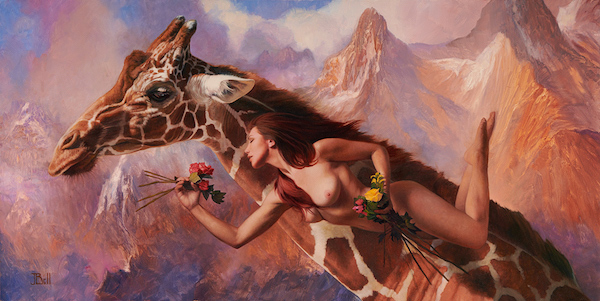
Julie Bell
Julie Bell has been one of the most powerful women painters in fantasy art since the mid 90’s. With loads of book covers and other genre work behind her she expanded her attention to painting images of wildlife in 2001. In recent years she has further branched into doing personal imagery that recombines her heroic images of women with wildlife in symbolic tableaus. Along the way she has won a raft of awards. Recently she and her husband Boris Vallejo had a large museum show at the Dishman Museum in Beaumont, Texas. Julie is a finalist in the Outwin Boocheever Portrait Competition at the National Portrait Gallery and she will also be having a solo show at Rehs Contemporary in Manhattan from May 4 through May 24.
Julie’s paintings have a sense of flow and character that unifies them to some degree whether the subject is heroic fantasy, pure wildlife, or personal symbolism. Her fantasy paintings form interesting parallels with Boris Vallejo’s work. This is more than likely due to their deep relationship to each other. In one of the closest collaborations in illustration history they worked together for many years, often painting on the same image.
It makes sense that these two would collaborate because Julie has a no-holds-barred aspect to her art that mirrors his. Her work’s unbridled quality also feels kind of heavy metal, even when she is painting images of women elegantly airborne among exotic beasts. It is entirely fitting that her images were featured as the art of one of the characters in the 2018 film “Mandy“, a movie that has been described as the most metal film ever made. Perhaps her worship of the mythic qualities of the physical body is subversive in our cerebral time.
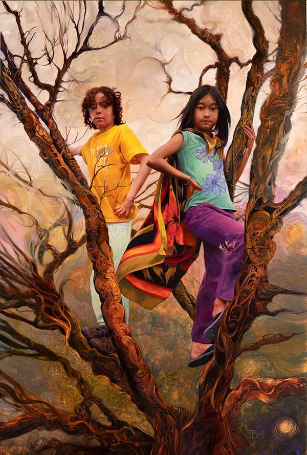
Julie has a similar approach to the human form as Boris in that muscular women are her primary focus, yet she inevitably sees them through a different experience. She also uses photography as the basis for the figures but her images in the last couple decades have increasingly come to involve a sense of ebb and flow of washes of bright color as a major element. Her women become enveloped in chromatic swirls as she pushes paint in loose thin strokes, somehow never getting it muddy. This symbolic use of the paint adds possible meanings to her portrait work. In her painting “The Tallest Tower in the Fortress” it takes a moment to realize how completely non-literal the tree is that the kids are perched in. The swirling of the sky also serves to take what would be a straightforward representation gently into another place. The image gains a somehow more human dimension than if everything were an illusion.
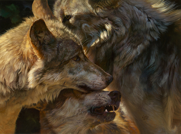
When Julie depicts wildlife this love of fluidity inhabits her rendering of fur in a striking manner. Wolves, lions, and bison depart from her source photos while retaining a presence like hyperrealism. Bafflingly she does not render this vital-feeling fur through painstaking little strokes but by a management of the oil’s properties of flow and solidity as it is held in the sweeps of the brush. The animals are brought to existence through finesse.
These wildlife depictions are also distinguished by a deep empathy. Julie’s irrepressible storytelling impulse draws out a mythic quality to everything she renders. Yet her wildlife is not anthropomorphic. Instead the social life and consciousness of the animals is acknowledged through her choices of scene and pose as well as the subtleties of graphic flow of their pelts or feathers.
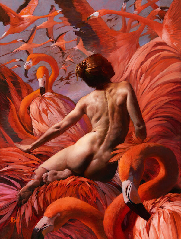
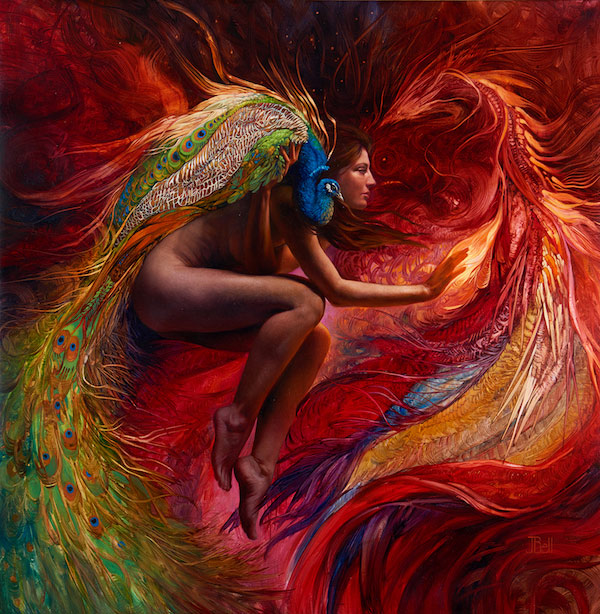
As she shows her work increasingly in galleries it has become about wildlife and women interwoven in symbolic ways. Often epic scale elements such as mountain ranges inhabit the background. All elements are painted with virtuosic representation. It seems natural to wonder if Julie’s profound identification with our beastly fellows may stem from that same desire that initially drove her toward heroic fantasy art. Animals can represent the ultimate sense of completeness of the body on its own. All other members of the animal kingdom have an awareness that is not burdened by human rationality and all its baggage. Julie’s work seems to grow at least partly from a contemplation of the intuitive force of an animal’s awareness.
More on Julie Bell in Beautiful Bizarre