Artist Tony Thielen talks us through the creative process behind one of his acrylic-based portraits in this exclusive painting demonstration. Tony Thielen is a painter with a gifted eye for texture and shape. He engages in a menagerie of ‘mark-making’ techniques, experimenting with material and line and colour to create deliciously rich mixed-media works that are heavy in expressive depth and energy.
Tony’s method can be described as spontaneous and fun. He does not have an over-prescriptive approach to artmaking, rather his works are free-flowing and organic; they develop on the canvas and, often, take directions Tony Thielen never intended in the first place. This instinctual approach to art results in loose abstract portraits that have juicy structures and forms that reflect each and every mark of the artist.
My method is more about the process than it is about the outcome.
Tony THIELEN
Tony Thielen uses feeling to direct his brush, but his painting technique is grounded in education. He takes a designer’s eye towards building a painting through layers and collage. In this behind-the-scenes, we follow Tony’s brushstrokes as he explains the painting method behind a new portrait. As well as being a gifted painter, Tony Thielen is a generous artist. In this demonstration, Tony Thielen not only shares the reasoning behind his artistic choices but he also teaches us that true creativity is about taking risks and being unafraid to paint outside the lines.
Let’s follow Tony Thielen as he talks us through the creative process behind this mixed-media portrait.
Getting Started
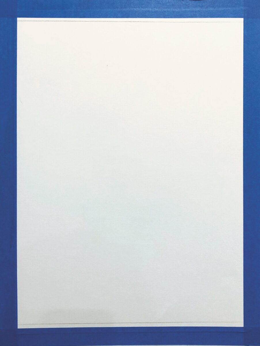
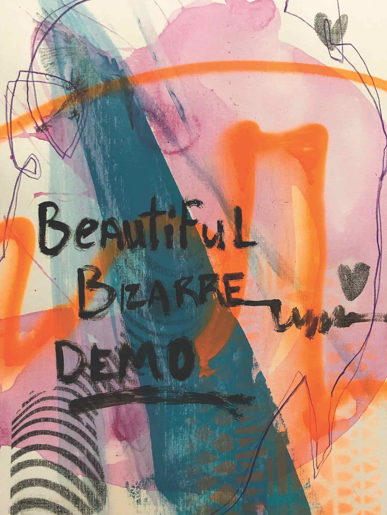
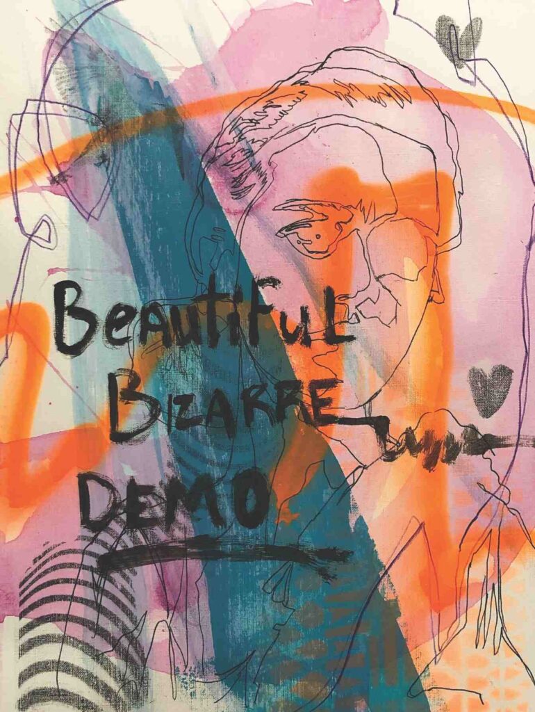
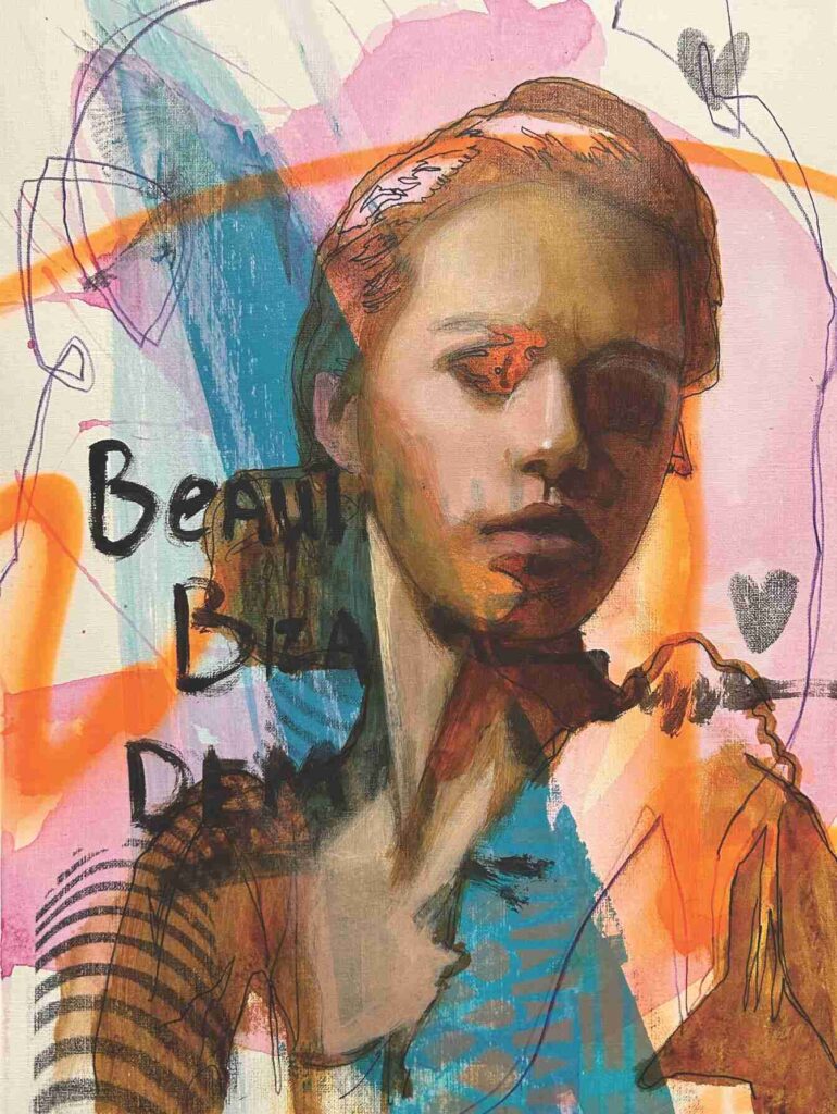
To begin, I first taped down a piece of Canson Canva-paper. I have never used it before, and I wanted to give it a try. Then I start adding colour, marks and other media to the paper. I want to kill the white of the support, and I want marks and colour I have to react to as I build up layers. Here I used gouache, coloured pencil, spray paint, transfers and acrylic paint.
Laying-in the Outline
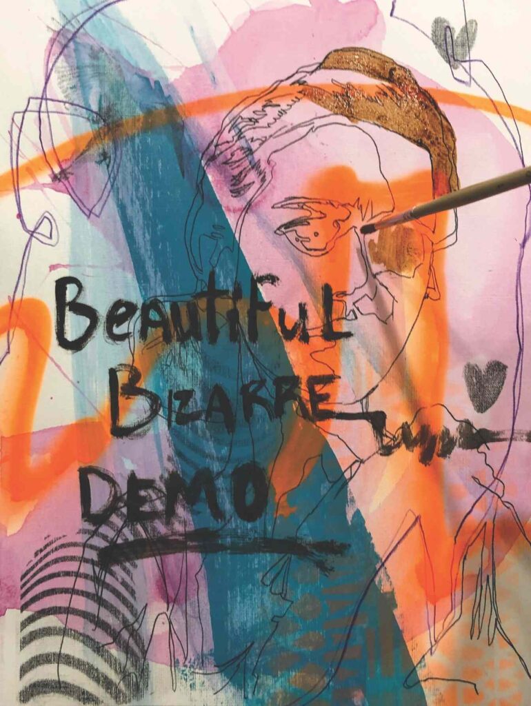
Using my reference, I lay-in a loose drawing and using a round bristle brush; I begin painting in the dark areas of my portrait by scumbling in transparent acrylics.
Shadows and Skin
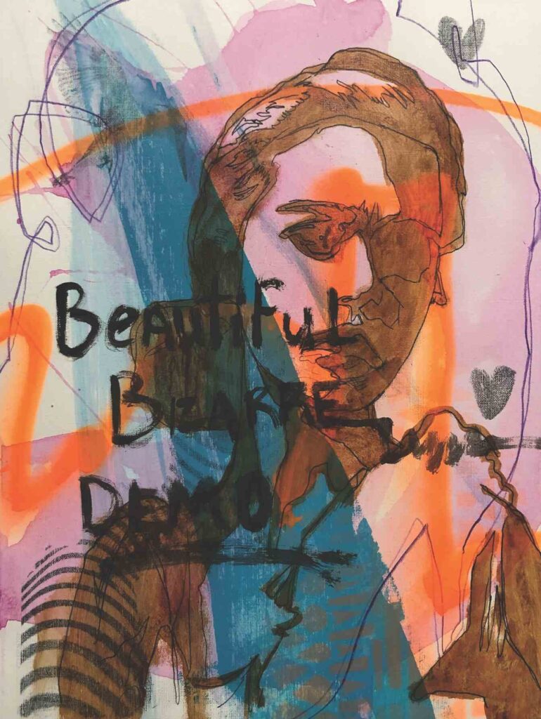
These dark areas were painted in with high-flow Transparent Brown Iron Oxide. For the skin tones, I use Transparent Brown Iron Oxide, Yellow Ochre, Cad Red Light, and Titanium White. The Yellow Ochre and Cad Red Light are thinned using a high flow medium. This way I can scumble back and forth in thin layers to both control the transitions of colour and to decide which areas I of the underpainting I may want to show through.
Collage and Marks
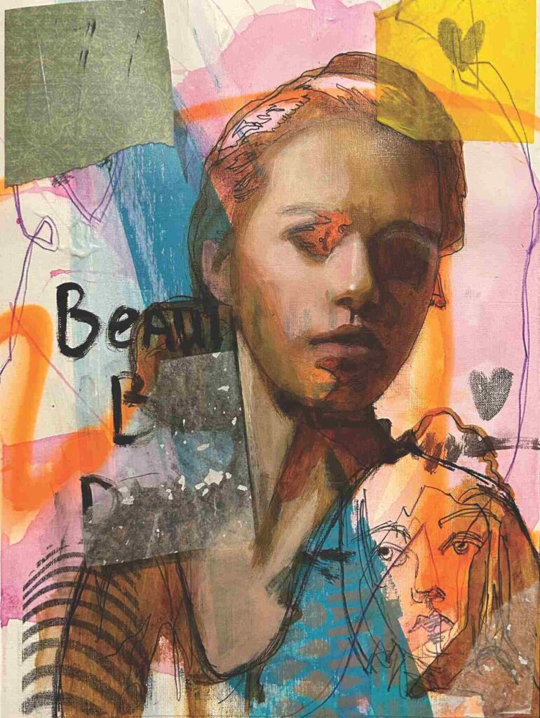
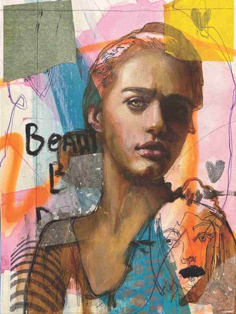
I added some collage papers and a few new marks. This is something you can do at any time in the process. And then I worked on detailing some of the facial features.
Experimentation
I decided to begin exploring the background and painted several different ideas. I thought simple shapes and colour would contrast well with the detail of the portrait. At this point, I didn’t feel the background was working, and the Canva-paper was buckling like crazy.
Changing it Up
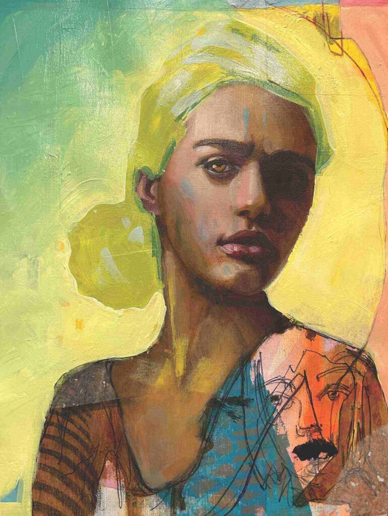
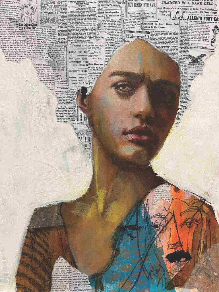
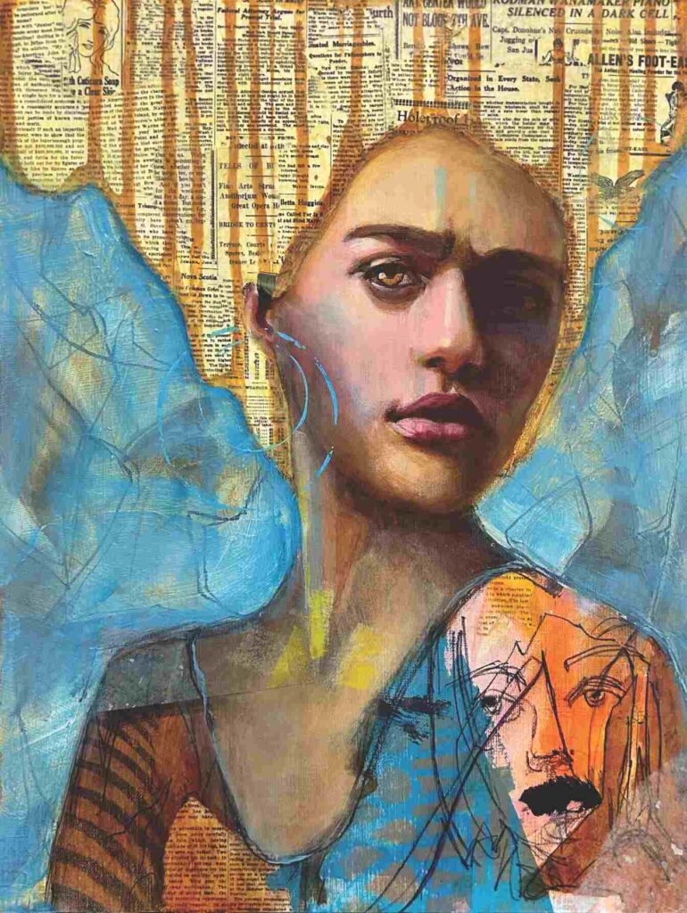
So I painted the background with gesso, mounted the Canva-paper to a wood panel using matte medium, and collaged in old newspaper printouts that I downloaded from the Library of Congress.
I flipped the painting upside down and, using high-flow Transparent Yellow Iron Oxide, squeezed the paint directly from the bottle along the hairline to get the flowing drips.
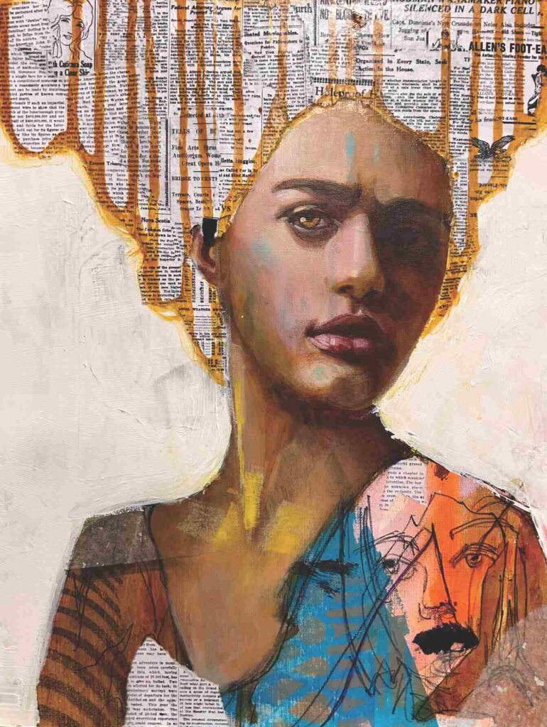
Seeking Balance
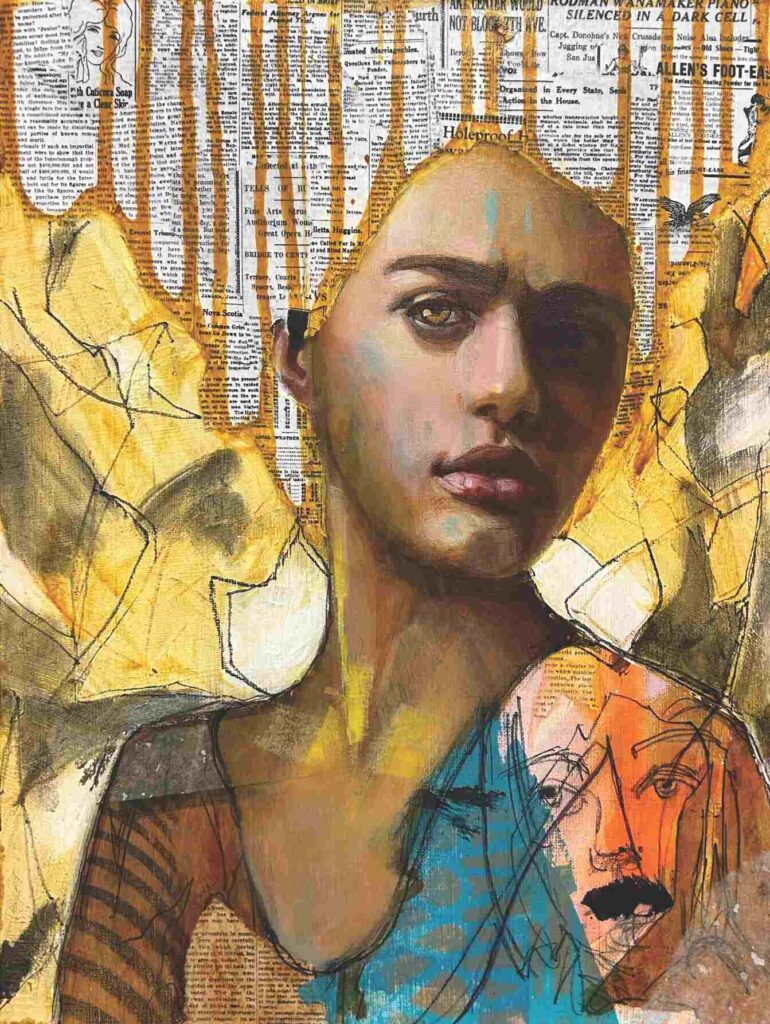
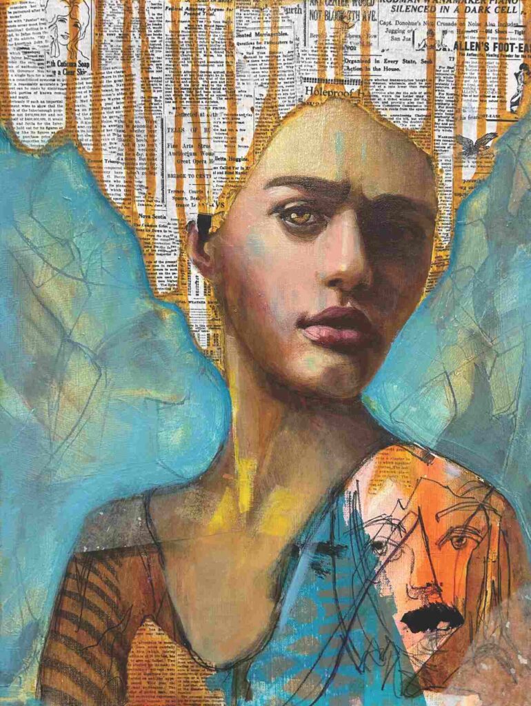
Trying to find a balance between foreground and background, I added Transparent Yellow Iron Oxide and expressive lines and shapes on the background. At this point, I also begin using oil paint. I glazed yellows and reds into her face. I also played with blue in the background, and having some of the marks and colours come through.
After that, I glazed yellow into the hair and played with the blue a little more. Something about the background wasn’t working for me, so I set it aside for a few days to let everything process.
Letting it Go
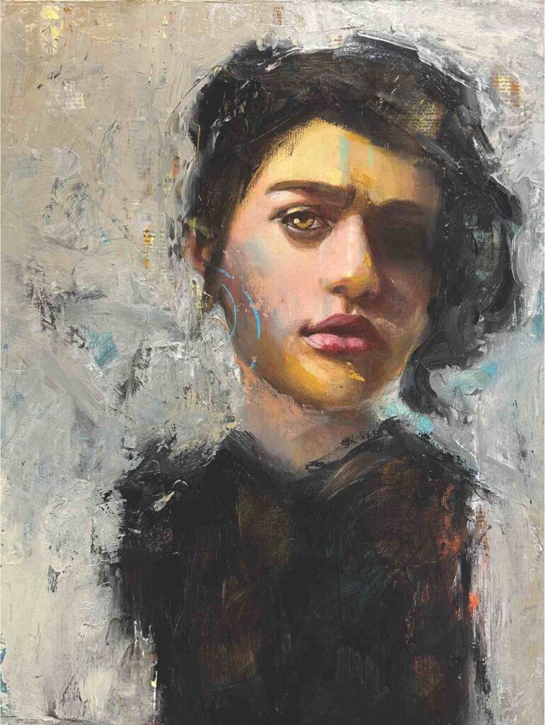
For the finished piece, I realized I was trying to hold on to her hair and all those beautiful marks on her torso. I had to let them go as they were all competing for attention. Using a pallet knife with black and grey oil paints, I was able to create a strong contrast in both colour and texture to her face. Changing her hair also allowed me to frame her face with a new hair design.
The End Result
All the underlayers of colours and marks play an integral role in the outcome of the finished portrait. Looking closely at the completed work you can see still elements of the previous layers sneaking through. Those previous layers also add to the texture of the final piece.
My method is more about the process than it is about the outcome.


