Each spring Frieze Week comes to New York and whips the art scene into a frenzy. Nearly 200 galleries gather at the Frieze art fair itself, hundreds more congregate in the fairs that have sprung up around it, and galleries with bricks and mortar in the city bust out some of their best spring shows. I happened to be in town to help hang an exhibition by my wife, Rebecca LeVeille (whose art has graced the pages of Beautiful Bizarre Magazine), so I offered to take on the assignment of covering Frieze New York, 2018.
Given that Frieze Week presents more art than any human could possibly take in, the first challenge was to develop method of approach. I decided I would follow the theme “Love not War”. The concept being that much of the sprawling art world is divided into factions who can’t stand each other. For example, in some environments it is a heavy insult to call something “illustrative” while in other areas anything reeking of conceptual art is dismissed as pretentious trash. Since Frieze Week offers an opportunity for a bird’s eye view of different sections of the art world, I decided to take a fly over of the land of up-market conceptual and abstract art. Thus I launched my search at the marquis event, the Frieze art fair itself.
My mission was to look for signs that some of the population in that realm had things of value for the readers of Beautiful Bizarre Magazine. I was going into the territory of the conceptual and the abstract to look for signs of love for the human form, for myth and for narrative. I am happy to say there were some such treasures to be found. I hope the reviews below show this by bringing to light interesting new artists, crossover galleries, and provocative questions.
Yet, before diving into the reviews, I hope you will allow me to set the stage. Frieze is in a tent on an island just off Manhattan. A visitor can get to it in a number of ways. For example, it is popular to take a water taxi with a bevy of beautiful arty types. I decided, however, on a different approach that saved time and, to some degree, ended up influencing the way that I looked at the fair. It turns out that you can take the subway to the closest stop, 125th Street in Harlem, then hail a cab to bring you to the Island where the tent is located.
On May 3rd, I emerged from the subway to find the particular stretch of 125th ahead of me lined by defunct businesses and occupied by a number of homeless people. For the record not all of Harlem is like this. When I hailed a cab and told the driver where I want to go, he turned in his seat and asked, “Where?”
Usually there’s no reason to go to Randall’s Island.
Yet, minutes later, we were on Randall’s and in another world as teams of sharp traffic directors waved the taxi to a stop in front of what may be the swankiest tent in existence. This structure’s thin white walls shone in the sun and wrapped themselves around tens, if not hundreds, of millions of dollars worth of contemporary art. The proximity of poverty to high art is nothing new in New York, yet the fresh experience made me think I should look for one additional thing in the search I was about to undertake. I should look for a way that the art inside Frieze connected to life on the other side of the bridge. Thus, with Harlem’s dust on my feet, I stepped into the show.
TAKASHI MURAKAMI
Frieze: Features Sector, Installation View, 2018
Artwork © Takashi Murakami/Kaikai Kiki Co., Ltd. All Rights Reserved. Photography Rob McKeever. Courtesy Gagosian.
Takashi Murakami at Gagosian Gallery of New York, Beverly Hills, San Francisco, Tokyo, Paris, London, Geneva, Athens, etc.
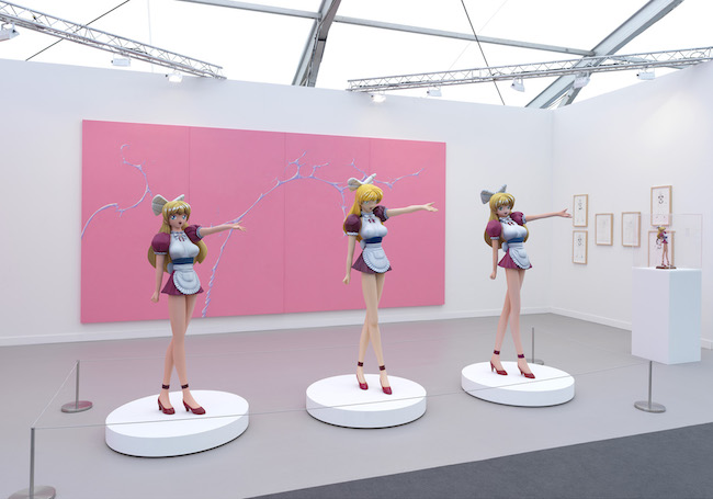
Takashi Murakami is an artist and art world force of nature. He is guided by an idea he calls “Superflat” which means that he sees no border between pop art and high art. Superflat also has a particular relation to the graphically flat images found in Anime, Manga, and Japanese advertising. With superflat Murakami has built a business empire that includes his own art gallery, Kaikai Kiki. At Frieze, however, his art wasn’t on display at his own place. Instead, it was shown at Gagosian Gallery, arguably the most powerful gallery in the world. Murakami’s work was true to form, it consisted of big-eyed, blonde, and busty stem-legged, anime girls in shorty-short maid outfits. To a large extent this art looked just like figurines you might find in any comics shop. The differences were that Murakami’s three babes were about eight feet tall, exquisitely crafted, and each a little different. With their euphoric expressions and outstretched arms, one might think that any comic geek who made it big would dig them as a rad addition to their millionaire’s play land. Yet Murakami might also say that making these figures oversized both emphasizes and questions the power that these ridiculous and cartoonish ideas of femininity have in our society. Certainly, the key to their meaning is in their scale. Of course, size is key to the meaning of every sculpture. If Michelangelo’s David were only twelve inches tall, we probably wouldn’t know about it.
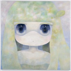 ob
ob
I Wished that I May Gaze upon that Changing Forest Forever
photo courtesy of Kaikai Kiki Gallery
ob at Kaikai Kiki of Tokyo
Murakami’s gallery Kaikai Kiki is important to know for any artist who is circling the aesthetic of anime. Yet Kaikai Kiki does stretch into other related forms of high and low art. Their most recent show in Tokyo featured James Jean, an artist who got his start doing fabulous covers for the (non manga) comic book “Fables” before turning to gallery pursuits. Unfortunately Jean’s work was not on display at Frieze, but there was one painting in the booth that I found unusually compelling. It was a piece by the artist ob titled “I Wished that I May Gaze upon that Changing Forest Forever”. A perfect example of the Superflat, the image was an oversized close up of a an anime head. Painted with a dry brushed cloudiness, the surface was mysterious and the giant eyes seemed to have great depth. The careful orchestration of geometry and colors gave it a quiet aspect like a Rothko. Being attracted to an artwork like this one seems to go hand in hand with a disquieting sense that the world is being taken over by anime heads. I wonder how much a viewer’s attraction to this painting is actually spiced up by the idea of willing submission to power.
Carlos Motta
Psalms, Installation Detail | Frieze New York, 2018
Carlos Motta at Galerie Mor Charpentier of Paris
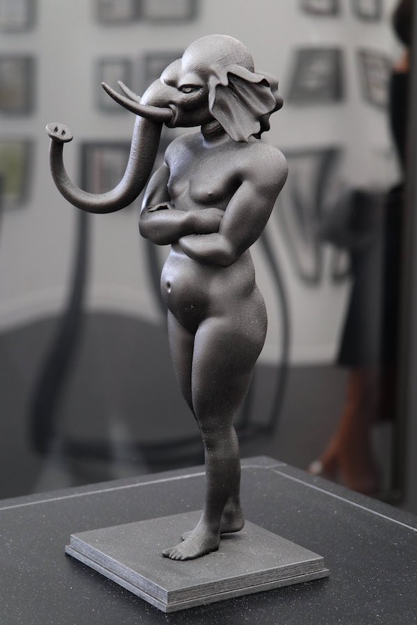
Once more, here were some figurines that would seem at home in any comic’s store. However, the back-story of the work turned that idea on its head. For this series, entitled “Psalms”, Carlos Motta plumbed medical and religious archives from medieval times to the 19th century. What he was looking for were instances where LGBTQ physiognomy or behavior was seen an abomination and was described in terms of horrific mythic figures. The sculptures on display are illustrations of these descriptions.
Thus Motta’s curious statuettes are actually meant to vividly call to mind what it must have been like to be born into an earlier epoch with any physiological or behavioral non binary sexual traits. We can safely speculate that these images of the monstrous that he has dug up were one step in a process of demonization that ended with vulnerable people being tortured and put to death.
Barry X. Ball, “Purity (Second Generation)”
Barry X. Ball at Galerie Thaddaeus Ropac of London, Paris and Salzburg
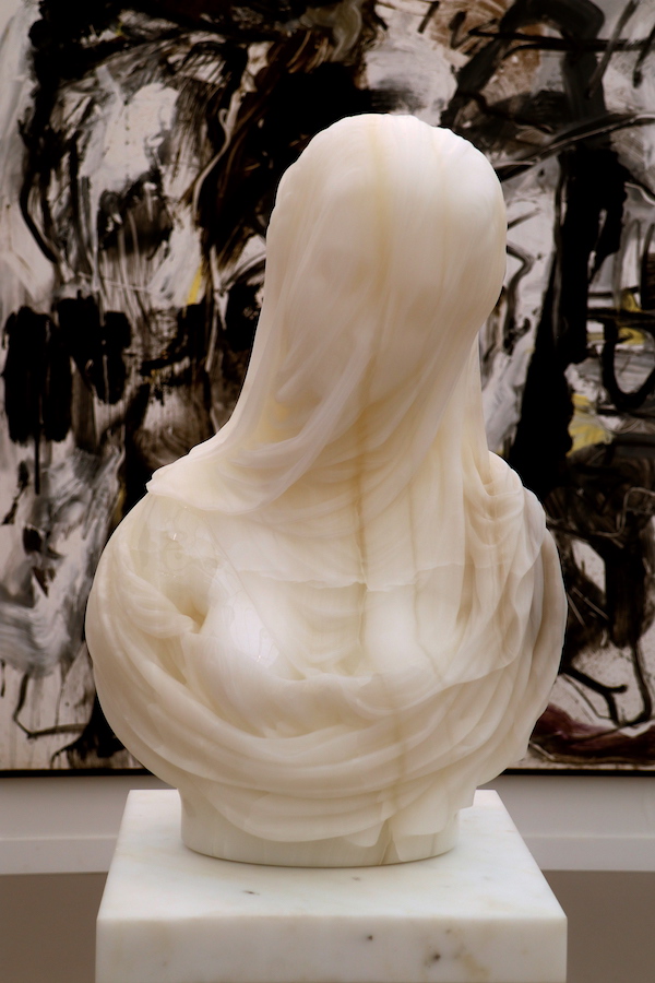
A very traditional looking stone bust of a woman in a veil stood luminous in this booth. Cut from white Iranian onyx, it looked like wax or like layers of translucent plastic. Ironically it was this object that most asked the question, “…but is it art?” Sculptor Barry X. Ball says this work, “Purity (2nd Generation)”, is an homage to a sculpture he loves, “La Purita” by Antonio Corradini (1668-1752). Ball’s”Purity” is part of a series he has been working on. For these sculptures, Ball makes a 3D scan of a marble sculpture, then, in a modeling program he alters the form in some small ways, usually changing the back of the work or the way the form attaches to the base, his next step is to have the shape machine carved into an exotic material, and to finish he carves his own meticulous final textures onto the work.
In photos, the difference between the onyx used for “Purity” and the marble of Corradini’s work don’t come across as much as they do in life. To illustrate Ball’s thinking it may be good to know that he made another version of “Purity” in Lapis Lazuli. The difference of materials there is very clear.
The finishing textures Ball applied to the work are emphatically his own in places. If you have done the final texturing of a sculpture you know how important those last subtle alterations can be for creating illusion with the material. Ball brings some areas of the exposed flesh to a super slick shine and creates a soft matte sense to the drapery in others–again, most of these effects do not come across in photographs. He works the veil in a way that masterfully enhances the sense of a transparent fabric over a face beneath. Everything he does make it clear he is trying to make a hopped up version of the work. He has said he wants to work in materials that the original sculptor could only have dreamt of using.
In my eyes, some of these flourishes were not improvements. Yet the big question is not so much whether the work is good. It’s whether the changes Ball made are enough to make the work his or whether it remains that of Antonio Corradini. Where does the edge lie between the copy and the new? Corradini himself was undoubtedly influenced by previous iterations of this kind of sculpture. The female face in a veil is the most crowd-pleasing effect in stone carving; with versions going back at least two and a half millennia. Does Ball’s undoubtedly new and opulent object have anything to say about our times? Does it add anything of substance to the tradition?
Tau Lewis
Installation detail, Frieze New York 2018
Tau Lewis
Installation Detail, Frieze New York, 2018
Photo Courtesy of Cooper Cole Gallery
Tau Lewis at Cooper Cole Gallery of Toronto
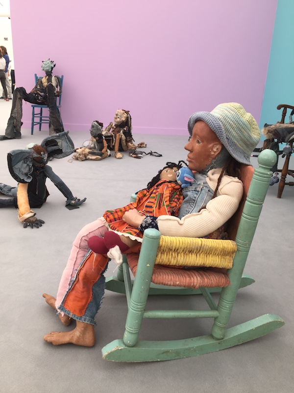
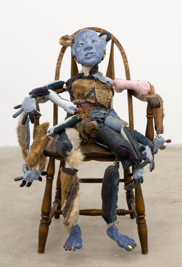
Ragged doll-like figures sprawled around this booth at first appearing to be pathetic characters crying out for empathy.
Yet as I looked further at Lewis’s work other meanings unfolded. The materials used started to refer less to poverty than to a kind of exuberant interaction with the environment. For a person who is clever and resourceful, treasure is everywhere. Lewis says her search for materials reflects the way that the African Diaspora must assemble their identities from the world around them because their history has been erased.
With time, even her more disquieting sculptures start to have a serene feel about them. Their characters seem to reflect both the hardships of the theft of history and the dignity and self-awareness that accompanies the process of making one’s self anew. Lewis’s way of finding profound meanings in prosaic materials comes to a point in the way she takes multiple colors of clay and blends them together to create faces. She says she uses this mixed up clay because she can make swirls in it that refer to the cosmos. Thus, a material that would normally be discarded becomes the stuff of the heavens. However, Lewis’s work is more than just an interesting repurposing of materials. Her art is anchored by her ability as a sculptor in the traditional sense. Even though she describes herself as untrained, she has deep abilities to form her character’s faces with sensitivity to the interplay of volumes, mark, and emotion. She is only 25; it will be interesting to see where she goes from here.
Ian Davis
Mine
Photo Courtesy of Night Gallery
Ian Davis
Simulator
Photo Courtesy of Night Gallery
Ian Davis at Night Gallery of Los Angeles
Night Gallery had a humble beginning as a late night art club in a strip mall in L.A. It now shows a wide ranging group of artists including the figurative painters Jesse Mockrin, Claire Tabouret, Derek Boshier, and Derek Fordjour.
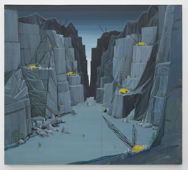
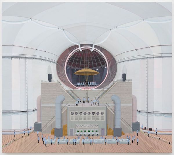
The paintings that drew me in to their booth were entitled “Mine” and “Simulator” by Ian Davis. Even though they are clear and graphic in nature they are best seen in life because one key to Davis’ visual style is dramatic scale change. His paintings feature minute figures of men in uniforms performing prosaic duties as they are dwarfed by spectacularly engineered environments. This is the basic description for Davis’ compositional style for the past decade or so, and using these elements, he creates a related mood in each work. Yet it does not get old. The paintings vary widely in the setting and in the groupings and the actions of the figures within. It may be that they seem closely related to each other because Davis has made a visual study of something that is important and complex but that no one else seems to be studying in depth. He takes as his subject the idea of the relationship between collective human action and setting. In an interview in Other Peoples Pixels he describes his paintings as being about “…the messed up stuff that happens when a bunch of people get together and stop thinking.” He cites a wide range of influences, including the epic multi-figure paintings of Bruegel, the work of British naive painter L.S. Lowry, and different sources for photos of large groups of people acting in sync.
Ed “Big Daddy” Roth
Aqua Nut
Brief Mentions
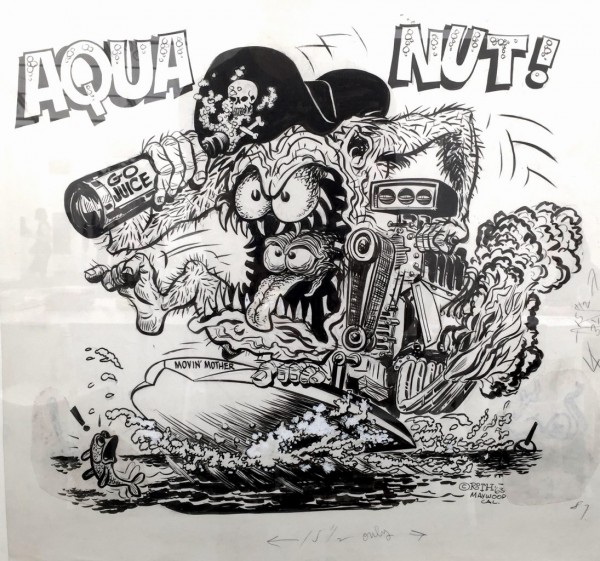
In my search I was looking for representational figuration and I walked by a lot of good work that was closely related to this goal. Some of it is worth giving a short mention. There were some cool paintings of interiors by Becky Suss and Momma Andersson. One of the most striking objects in the whole fair was a relief sculpture made of scorched wood and lead. By Matthew Day Jackson, it was a reproduction of a Bierstadt painting that had in turn been used as a “Life” magazine cover. So basically it was a charred Bierstadt with “Life” magazine text over it. Also of note, underground comics were bubbling up in galleries here and there. Drawings by Ed “Big Daddy” Roth and Vaughn Bode hung at the New York Gallery named “Canada”. Tom of Finland was well hung at David Kordansky Gallery. Raymond Pettibon inks, looking like misplaced pages from some counter-culture publication from the ’80’s showed on the walls of at least three galleries. Finally, looser figurative works were sprinkled throughout. Notably some charming early David Hockney drawings hung at one end of the tent (some of his current and charmless digital work hung at the other). There was also an elegant portrait by Alice Neal.
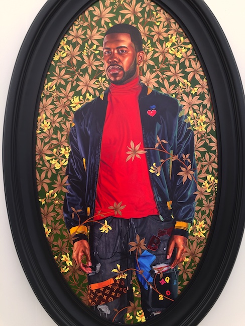
Kehinde Wiley
Alexander Cassatt
Kehinde Wiley at Stephen Friedman of London
Stephen Friedman shows figurative sculptor Stephan Balkenhol and painter Toyin Ojih Odutola, yet the painting I went to see was by Kehinde Wiley.
Wiley is undoubtedly one of the best-known contemporary artists working in representational figurative painting. He has crossed many barriers in the art world with a string of high profile gallery and museum shows. When he was selected to paint the official portrait of President Barack Obama, he became as much of a household name as any artist.
Wiley got his start by working with young men off the streets of Harlem. He now works in the same basic mode but with people from around the world. He begins his paintings by photographing his subjects in a pose that precisely reflects a specific historical portrait painting. I would like to pause for a moment in describing this stage of the process because Wiley’s brilliance here is under appreciated. This acuity of pose is what creates the feel of classical portraiture in his work much more than does his style of painting. Very few figurative painters working today understand the importance of gesture to this degree. Wiley works to get the correct tilt of head and turn of the torso out of his non-professional models. For the next step in his process he paints the portrait figure and develops a decorative pattern to use in the space around them. To conclude the work he sends the canvas to China to have assistants there complete the rendering of the complex background motif. Wiley’s managing of all the cultural references along the way of this process are his true genius, in my eyes. I would argue that even his use of labor in China is a provocative update to the renaissance studio practice where unnamed apprentices would fill in large parts of paintings that we now attribute to the masters. There are many artists now, such as Jeff Koons, Takashi Murakami, and Damien Hirst who employ such unrecognized workers to create the art, which bears their signature. That Wiley has been outsourcing to China is just a little more emphatic. It clearly says that he believes some parts of the painting are only craft, just like any other kind of manufacturing. Wiley works from a complicated place, yet one thing is certain: he has created a bridge between the street and the high end art world.
Viewing his portrait of Andrew Cassatt at Frieze was a fitting conclusion to my tour. As coincidence would have it, the sidewalks on which Wiley found his first portrait subjects were the ones that line 125th Street. That’s the same Harlem concrete I had just tread that morning, and to which I was about to return.


