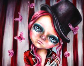
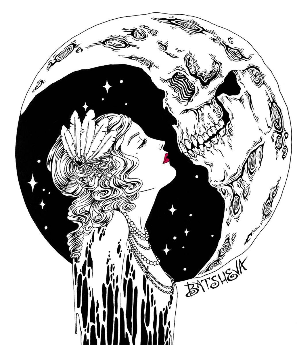
Every illustration crafted by Daniella Batsheva transports its viewers to an unusual space between the old and the new. Where 19th century masters meet modern day punk rockers to create a new kind of classical style that oozes horror, playfulness and beauty. Every illustration is filled to the brim with intricate details that stimulate the senses as vibrant hues splatter the page in organized chaos. Wonderfully whimsical women of all kinds take center stage as Batsheva plays with both the beautiful and grotesque to create her own little world.
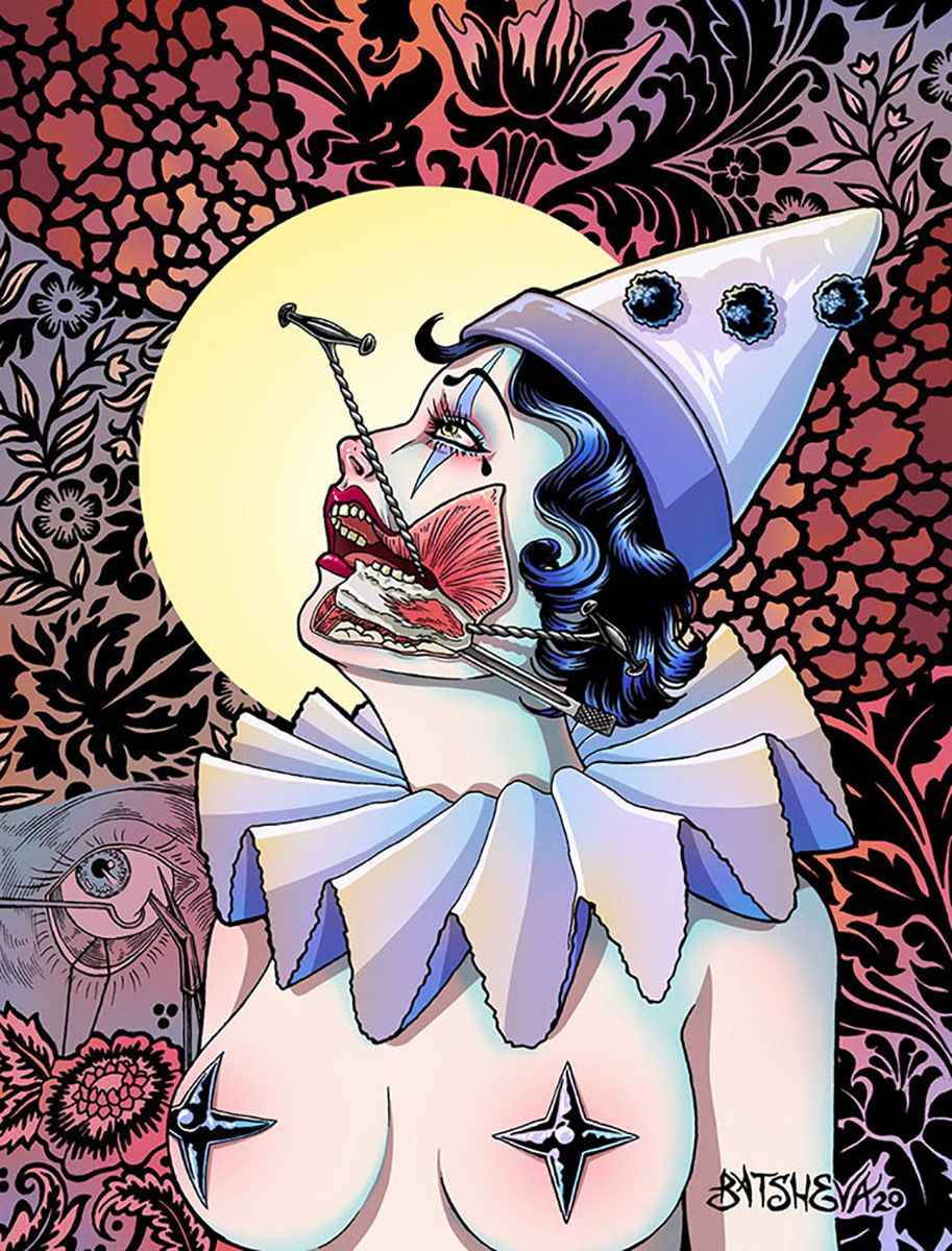
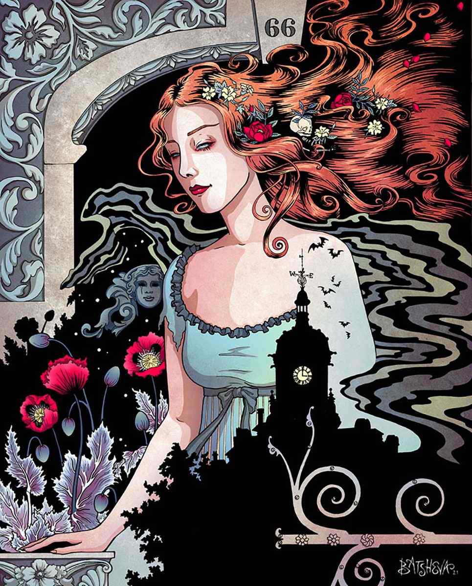
Daniella Batsheva is a visual artist and illustrator based in Los Angeles, California. Batshava is best known for her illustrations, which have a heavy focus on gothic and horror-based imagery with an emphasis on detailed and intricate linework. Her style bridges the old works of 19th century nouveau with more modern themes often acting as a gateway between music and art. Music plays a vital role within her artistic process as every illustration has its own soundtrack. Alongside music, Batsheva also has a massive pool of artists in which she draws inspiration from including Louis Theophile Hingre, Peach Momoko, Harry Clarke, Nadir Quinto, Junji Ito and Elisabeth Louise Vigee Le Bruna among many others.
I’ve always known that my artwork was very feminine, people pointed it out frequently, but I guess it’s because I view life from the perspective of a woman. I think of men that only draw masculine pieces and I always wondered why they never had to answer for it. We allowed masculinity to become the standard somehow and femininity is seen as less serious.
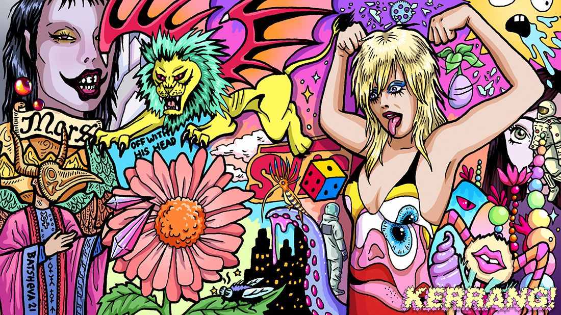
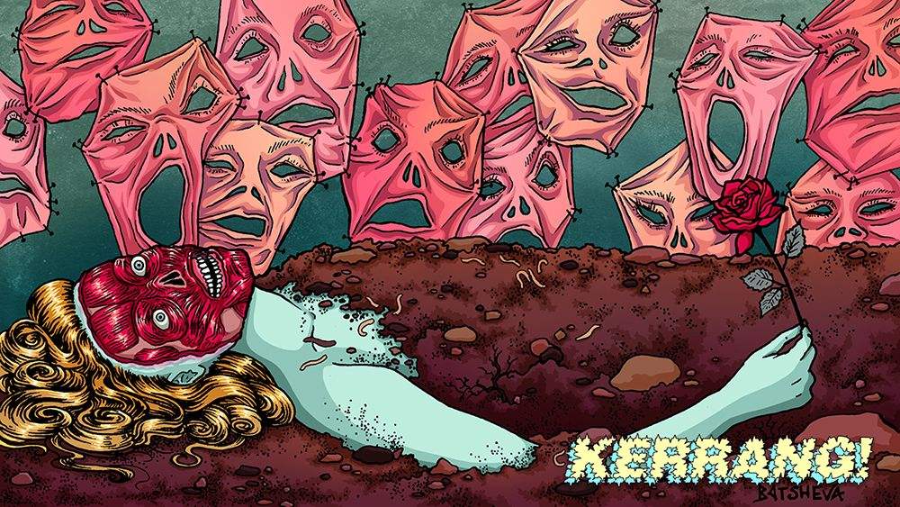
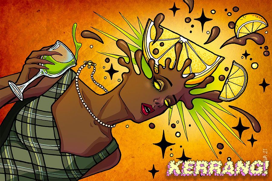
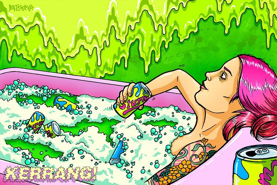
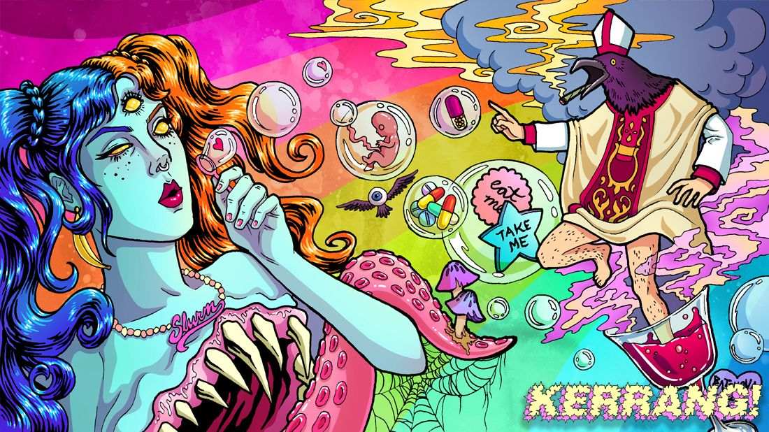
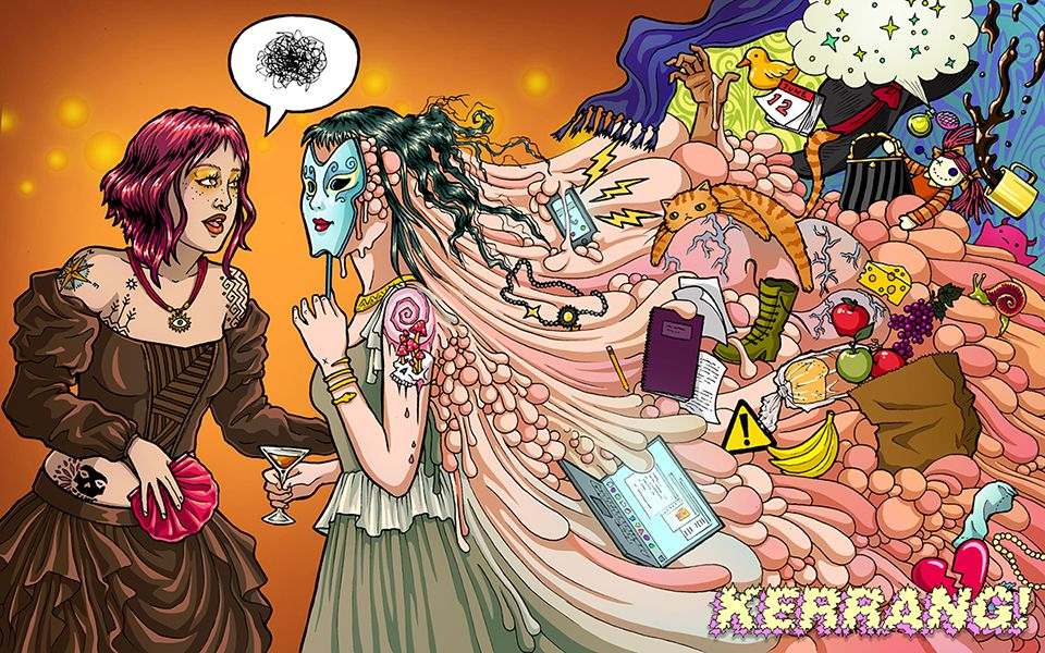
Daniella Batsheva studied illustration and graduated from The University of the Art, Philadelphia back in 2011. Since then, Batsheva has been using her unique style to suit the needs of the various clients. Over the years she has worked with a wide range of clientele including Kerrang! Magazine as their first female lead illustrator, Pizza Girl to create their sauce packaging, Paris Jackson on her tour posters and merchandise as well as horror film festival Shriekfest for their trophy design.
Interview with Daniella Batsheva
I read in your bio that art is a compulsion for you, and you can’t function without it. What was it that sparked such a passion for art and made you realise you wanted to become an illustrator?
That’s the funny thing, I was drawing before I was self-aware enough to even have a passion. They were scribbles, for sure, but my mother said that when my motor skills were beginning to develop, the first thing I went for was a pencil. There was never a question that I would be anything other than an illustrator. Drawing was the only thing I was interested in doing, so I was lucky that the people around me allowed it. I did get scolded by teachers a lot, though! There were some efforts made to have me do something more reasonable for a career, but I can’t imagine being anyone else.
I was wondering if you could take me through your development process when you start working on a new illustration? How do you approach a new piece and how long can your artistic process take?
Sure! I work closely with my clients, and I want them to have a fun experience helping me develop the piece. We gather lots of reference and if the imagery we have feels disjointed, I think carefully about the common threads and weave them together into concepts for sketches.
Once we have some sketches worked out, we pick the favorite, I’ll redraw it to scale, and I’ll refine it so that the composition and details can be approved for the final piece. I start with a pencil drawing, ink it, then colour it digitally. This can take anywhere from 12 to 40 hours, depending on how elaborate the piece is. I would love to do something on a massive scale that I could work on for a couple months, but I haven’t yet had the opportunity.
You have a large and rather eclectic list of artists that inspire you. Do you find having such a variety of inspiration works as a tool for you as an artist? Especially when considering things such as finding your own art style and developing new ideas.
Absolutely! I tend to get bored very easily, and if I’m in the mindset of creating, I need a constant source of information and a lot of visuals to go through, mostly for colour palettes and anatomical or object reference. I feel very comfortable with the style I’ve developed, so if I ever do anything differently, it’s usually because I’m paying homage to another artist. This isn’t to say that my stylistic approach is set in stone, I’m sure it’ll evolve down the line, but I’m content with it right now.
Your illustrations mix vintage styles and techniques with modernity. Has it ever been challenging to find that right balance between old and new styles and themes?
Yes, it’s actually been a challenge in many situations. Merging modern and vintage can be pretty complicated because you have to find that sweet spot that works for you. There were times when I made things that looked too vintage, and when that happened, I didn’t like it because it came across as too naïve. When it went too far in the direction of modern, the pieces started feeling cheap to me. The balance is hard to describe because it boils down to personal taste.
What are your most used materials as an illustrator?
A simple mechanical pencil with 2B lead, microns, and Pentel refillable brush pens.
Your use of colour is very playful and fun which make your illustrations really pop. I’d love to hear a bit more about your relationship with colour as an illustrator and how you utilise it to get the best out of it for your artwork.
I get a bit selfish with colour because the palettes I choose are ones that are most pleasing to my eye. There’s some truth to the term “eye candy,” and I want to capture that combination of bold and bright colours that are fun to get lost in. I like very lush and tasty looking palettes. This isn’t as easy as simply picking the loudest or most saturated colour. The palette has to be crafted in a way where there is an opportunity to create depth in space as well. If I want to highlight a very specific bright colour, I actually use it sparingly and in the area where I want the viewer to focus. For all my palettes, I pick the colour I want to be highlighted and I build a palette around it, using complimentary and muted colours so that the highlight can shine, undisturbed.
Women are a huge theme throughout your illustrations. They range from elegant to badass to creepy and unusual. What inspires you to have the feminine form as a key theme within your work?
Well, I’ve always known that my artwork was very feminine, people pointed it out frequently, but I guess it’s because I view life from the perspective of a woman. I think of men that only draw masculine pieces and I always wondered why they never had to answer for it. We allowed masculinity to become the standard somehow and femininity is seen as less serious.
I’ve always drawn women as my characters because men didn’t play a large part in my life. Sure, I saw boys when I was in school, but they all had germs and smelled like hot dogs, so they didn’t interest me. It’s also about representation. I wanted to see more women in the context of badass and creepy, so that’s what I choose to draw! I hope that my art can ultimately add to the many creative voices that are pushing for femininity to be a standard that is as valid as masculinity in illustration.
Music is a huge part of your art and I know that each of your illustrations has its own soundtrack. Do soundtracks have a large impact on the overall feel and aesthetics of a piece? Or do soundtracks serve a different purpose?
The soundtracks never change how the piece turns out stylistically, but having the right song or tune helps put me in the mindset of the environment I’m trying to create. I have musical pieces that I interpret as colors or themes, like Jupiter or palm trees, and I’ll pick something out that I feel matches the world I’m illustrating. Sometimes I don’t actively listen to music and I’ll put on something very familiar that I can zone out to. It might sound weird, but having electronic music and tracks that drone on are very meditative to me, and it helps keep me from fidgeting.
Can you believe Spotify made fun of me for my tastes? Haha! They said something along the lines of, “You’re one of the few people who can listen to the sound of a modified fan for hours. We’re not judging you.” I also came in an insane top 0.01% of people who listen to Aphex Twin. So that should give you an idea of my somewhat embarrassing listening habits. Something is always playing, night and day.
Merging modern and vintage can be pretty complicated because you have to find that sweet spot that works for you.
Speaking of soundtracks, what soundtrack would you pick to represent yourself as an illustrator?
It would have to be a custom playlist and the combination of artists would be confusing to people who don’t know me personally. Everything from Air and April March to Samhain and Sisters of Mercy, some Elder Island and Cab Calloway…“Ageispolis” by Aphex Twin is a track I never don’t want to listen to.
You do a lot of commercial work, often working with brands, musicians, festivals, etc. Do you have any dream collaborations?
As far as dream collaborations, I would love to work with The Distillers and Brody Dalle, Courtney Love, Perturbator, Amyl and the Sniffer. I’d really love to do illustrations for a metal festival, something really sludgy and brutal. Many of the artists I listen to aren’t putting out new work right now, or I can’t see my illustrations fitting their music, but I’m always open!
You have your eggs in many baskets when it comes to your work, you do everything from tour posters to pizza sauce labels to magazine and book illustrations. How does it feel to be able to create such a diverse range of artwork and products and see your work used in such a variety of ways?
It’s wonderful! I learn so many amazing things from so many people that all come from different backgrounds. Like with Pizza Girl, I needed to learn the standards that the US government sets for food labels, placements and sizing, otherwise it couldn’t go to print. I love that I can learn about different industries just by creating art for them. I feel like I’ve gained a better understanding of how the world works through my job. Every client has different needs and restrictions, so I’m always taking into account what the guidelines are for each piece. It always makes me happy to see that art is still necessary and wanted in so many different areas.
When you aren’t working on illustrations what do you get up to?
I like to wander. I’m a walking person, and I particularly love exploring European cities. I like to wander down quiet alleyways, into coffee shops, libraries and thrift stores. I always keep an eye out for critters like spiders and lizards and take photos of interesting architecture so I can draw it later. Strangers like to strike up conversations with me. The most interesting person I can think of in the past year was a kind homeless man in London who was in tatters, yet he still offered me one of his pastries from Greggs. Then he turned to a pigeon and loudly cursed its mother.
What’s next for you as an illustrator? Any exciting projects you can tell our readers about?
There will be some upcoming exclusive pieces for Trashville, a London-based arts and entertainment brand and I will continue to provide UK alternative culture brand Kerrang! with illustrations. My first full book I’ve designed, Heavy Metro, showcases the work of legendary rock photographer Gene Ambo, and was just made available for purchase to the public.
I’m also working on multiple pitch decks, book covers and private commissions that will be revealed once published. When it comes to work that’s entertainment related, I’m usually given an NDA, so I tend to stay quiet about it, but I’ll always update my social media pages once my work is released!
As for personal work, I’m planning on creating a series of pieces that explore Middle Eastern Jewishness through a gothic lens, because so much of what we see as “goth” is derived from a Christian place. When I was younger, I really needed that kind of representation, but it didn’t exist so I hid my cultural background. I’m hoping I can create a world through my illustrations that other weird Jewish kids, like myself, can call their own.