Exclusive Interview with Brodie Colbourne, 3rd Prize Winner of the iCanvas Digital Art Award 2021 Beautiful Bizarre Art Prize
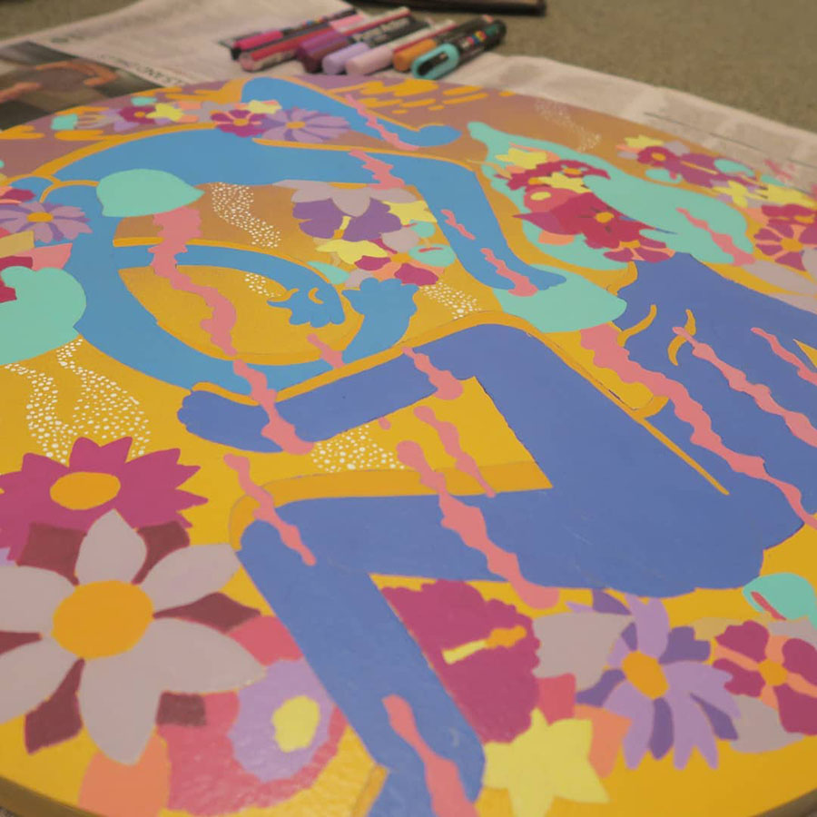
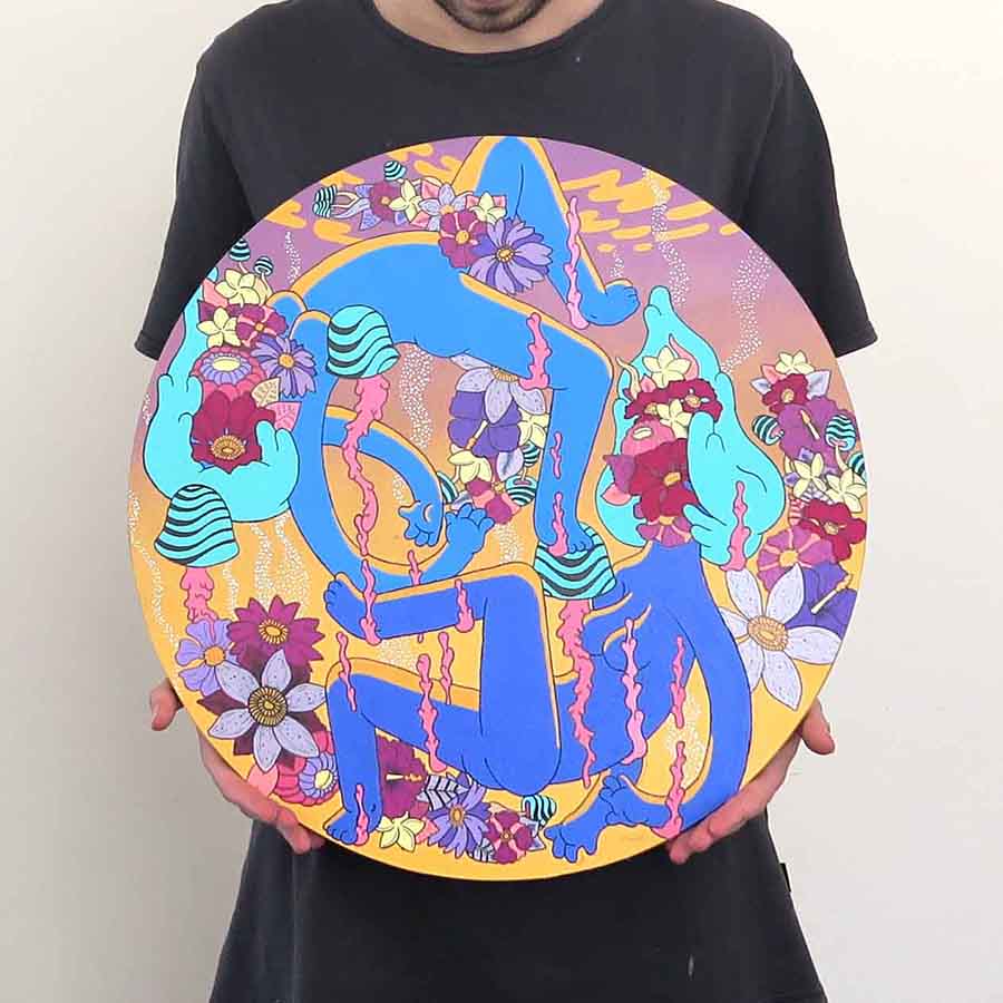
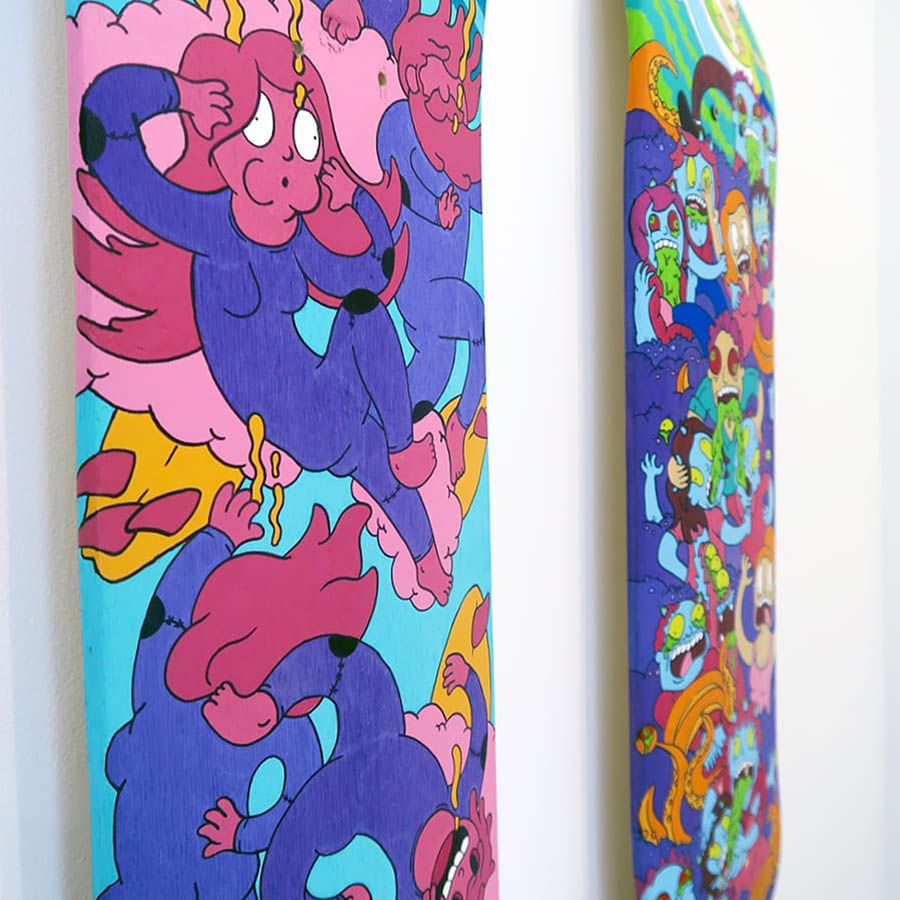
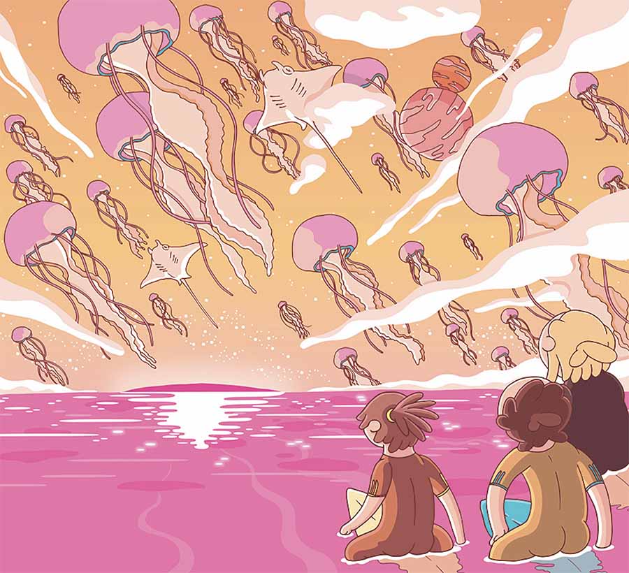
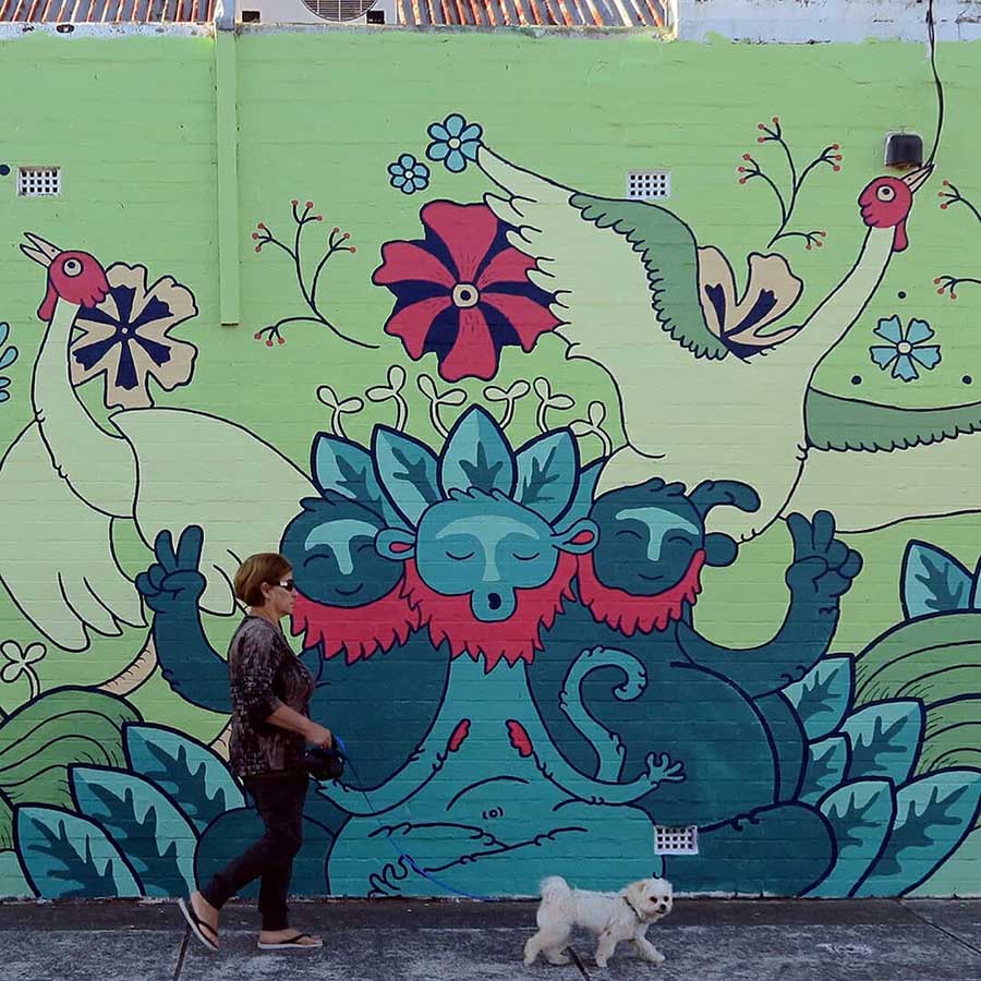
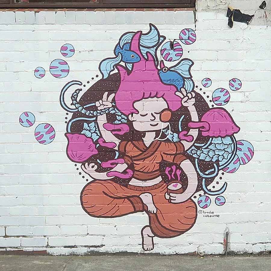
Brodie Colbourne’s digital illustrations, which often begin as hand-drawn sketches, explode with lucid colors and exude psychedelic energy. Even as still images, they vibrate with movement. Each work is a symphony of organic forms and stylized figures that coalesce into a kaleidoscopic composition. His pieces have a patterned, collage-like aspect to them due to his penchant for leaving limited negative space. When your eyes wander across an image, they discover new details in every corner. Yet, his motifs and palette preferences are more than simple aesthetic decisions. His work has a strong narrative component in that these characteristics make symbolic references to his personal life experiences including relationships, travels, or the artist’s love of surfing and the ocean.
“Psychedelic Dreaming” earned him the title of 3rd Prize Winner of the iCanvas Digital Art Award this year. Building from his roots in graphic design, Colbourne has shifted his focus to illustration art in recent years. For him, winning the award presented by Beautiful Bizarre in conjunction with iCanvas reaffirmed his decision to embark on this path, encouraged him to reflect on the progress he’s made thus far, and motivated him to continue pushing forward in his illustration career.
Interview with Brodie Colbourne
Why did you enter the Beautiful Bizarre Magazine Art Prize?
I’ve been a fan and following Beautiful Bizarre Magazine for a while now. Earlier this year, I saw a post about the art prize and kept it in the back of my mind. I was finishing up a big illustration I’d been slowly chipping away at and by the time I finished it, entries opened up. The timing lined up pretty well. I was quite happy with how the piece turned out and quite happy with the quality of the work that I had been producing recently. So I entered my illustration to see if others thought that I was at a good standard too.
What do you feel you have gained from this experience?
It’s definitely boosted my confidence in myself and my illustration work. Having that validation is really rewarding. I’m at the very early stages of my illustration career. At the moment, my circle is pretty small, and sometimes, illustrating can feel a little isolating. So to have a well-respected magazine congratulate me on my entry opens my eyes and helps remind me of where I started, how far I’ve come, and where I’m currently at. I’ve been striving for a while now to reach that next stage of quality in my skills to start reaching out and sharing my work, and now I feel like I’m at that point.
Would you recommend it and encourage others to enter? If so, why?
Yes, of course :)
How long have you been working in the medium of illustration? What initially drew you to it?
I’ve been illustrating for about six years. I started drawing back in 2016 (wow, time flies) as a hobby, then slowly started taking it a little more seriously, and as time went on, I started to dedicate more and more time to it. I initially studied graphic design and have been working as a designer. It’s been fun, but it can also feel very restrictive because there are so many rules, standards, and guidelines to follow – you’re always working in someone else’s image. In illustration, on the other hand, there’s none of that. It has a lot more freedom and you can really express yourself with it. I’m still honestly finding my way, but so far, the people I’ve worked with and the projects I’ve worked on have been so much fun and rewarding.
I use a color palette that I like to call my “bubblegum colors.” They’re a mix of pastel-like colors and sometimes are really saturated and bright.
Your style has a foundation in a cartoon-like aesthetic with a clear emphasis on color palettes. Is this inspired by specific characters/televisions shows or from other artists you admire? Both?
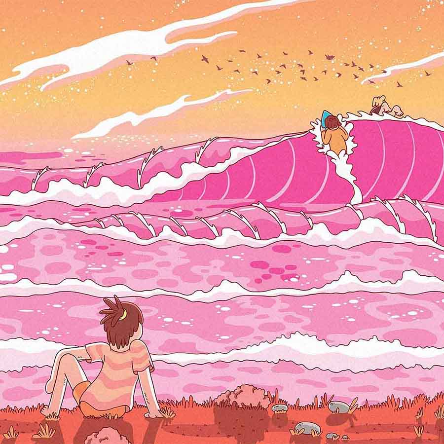
Color would have to be one of my favorite parts of illustrating. Color really talks to me. I find that it can be really expressive, you can really capture a mood and feeling, or a moment with it, and it’s super fun to experiment with and play around with! I use a color palette that I like to call my “bubblegum colors,” they’re a mix of pastel-like colors and sometimes are really saturated and bright, like bubblegum. Those pinks and oranges I often use are inspired by sunrises and sunsets.
I grew up watching a heap of cartoons and playing a few video games, which I feel has definitely inspired me to pursue my cartoon-like drawings. I’m still watching cartoons now. I also particularly love psychedelic and lofi art because they heavily rely on their use of color. They’re nice to look at from time to time to help give you a few ideas.
In what ways would you say your style has evolved over the years? I notice that whereas earlier work was almost collage-like in how you grouped your subjects together, now there is a more defined separation between the main figure and the background.
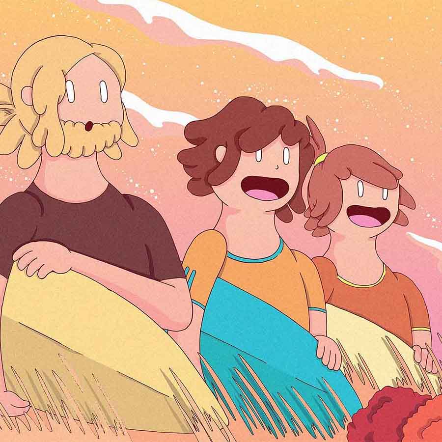
Drawing characters has always been a focus for me. I guess in the beginning, it was nice to focus on just the characters and practice my form, getting postures right, and drawing those awkward body parts like hands and faces. As I’ve become more confident, I’ve started bringing a single character to the spotlight and adding a scene around them to add a bit of context and help build a narrative.
How do you select the colors in each piece – is it intuitive or do you have a method behind the various colorways you use in your work?
I usually have an idea from the very beginning of what sort of colors I’d like to use. It’s usually in the back of my mind while I’m sketching too if I haven’t decided yet. For example, when I was working on a small series of surfing illustrations, it was inspired by an afternoon surf with some friends. The sun was burning red and we watched it set over the water’s edge. So I wanted to use really vibrant reds and oranges to capture the mood of the sun and the timing of the day that the story is set in too.
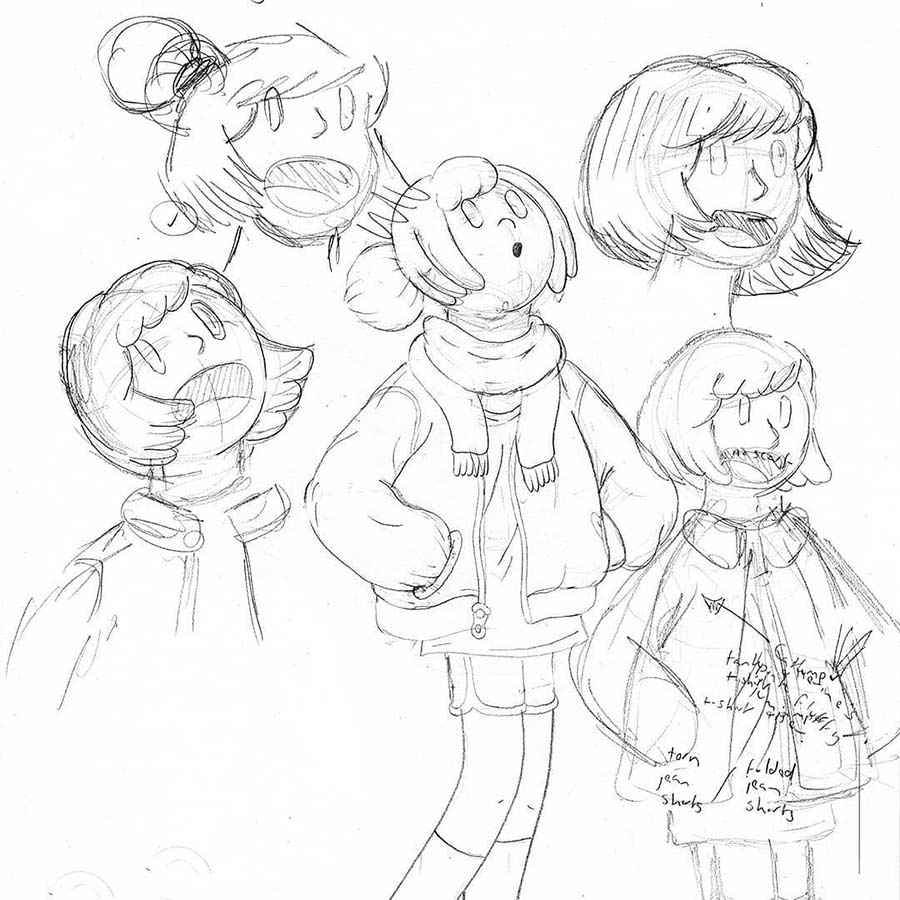
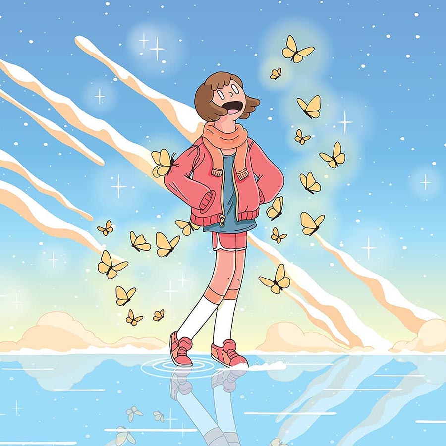
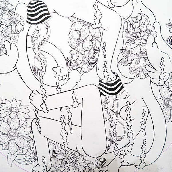
I just need to see something on paper first, whether it’s a scribble or a proper sketch. Nothing beats good old-fashioned paper.
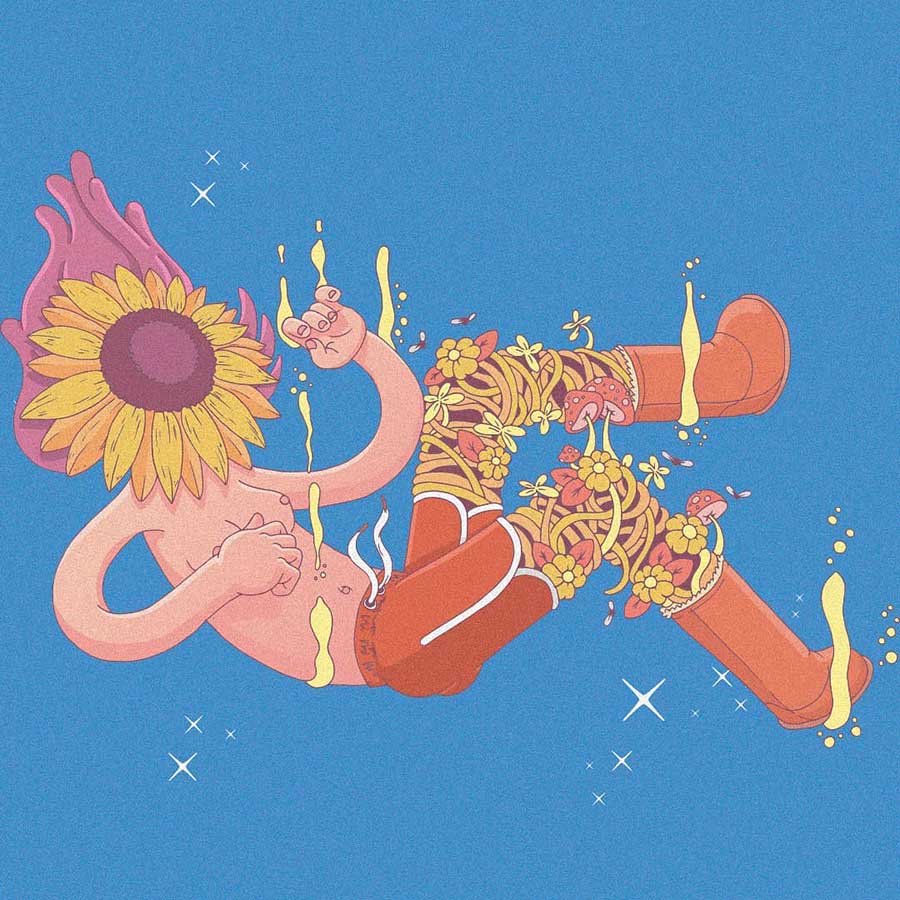
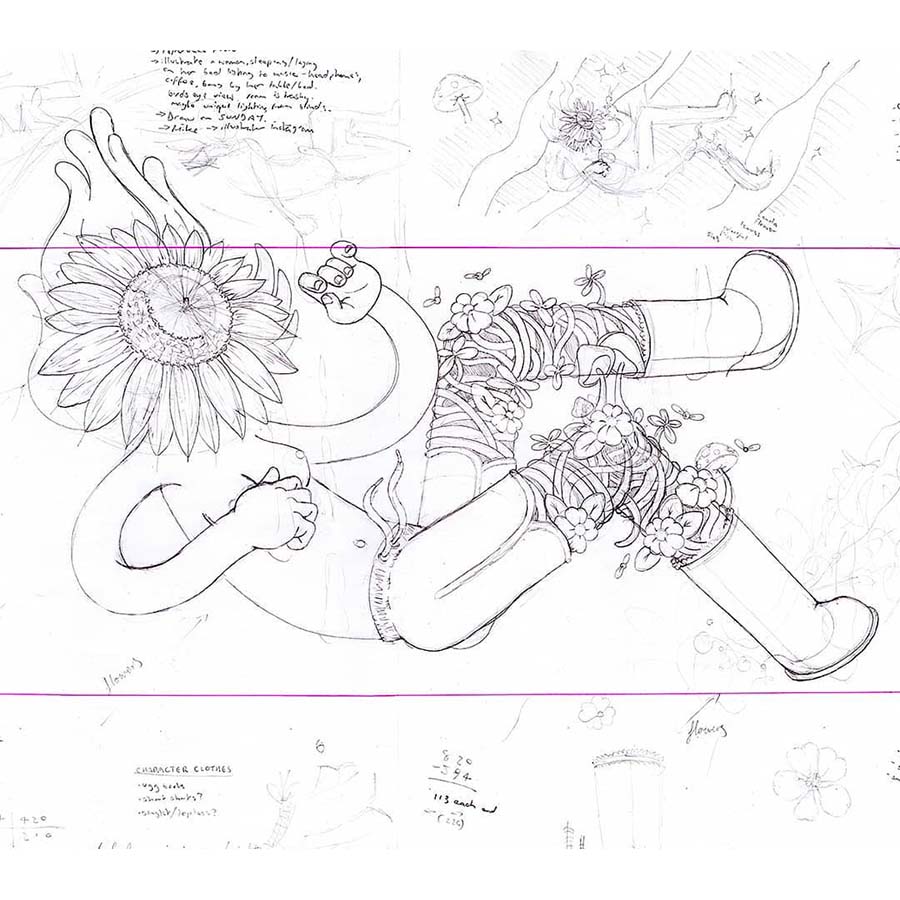
I’ve noticed you start illustrations by sketching with graphite in your notebook before eventually generating the final image in Illustrator. What do you get from beginning the process by hand rather than digitally?
I just need to see something on paper first, whether it’s a scribble or a proper sketch. Nothing beats good old-fashioned paper. However, I am noticing that it can become a little time-consuming since I am finishing things digitally. Scoring the Wacom drawing tablet from the art prize has been really awesome. I’m very much looking forward to teaching myself how to draw with this and hopefully improving my workflow.
On your website, you’ve taken the time to explain the inspiration behind much of your work: feelings, people you know or have met, memories of a trip, or symbols tied to your love of surfing. For example, one entry even goes so far as to provide a breakdown of the meaning behind each subject on your surfboard illustration entitled “Sunset Over Sea” and another details every step of the process of painting custom artwork on a balalaika. Do you think your work necessitates this explanation or is it more about simply wanting to make it accessible to as many people as possible?
I like to think of myself as a bit of a storyteller. As I’ve started to figure out where I want to go with my illustration work I’ve started to realize that. I’m very interested in pursuing character design and storyboarding in the field of animation. Storytelling, or my silly ramblings, has been my way of creating a narrative of what I’m putting on paper.
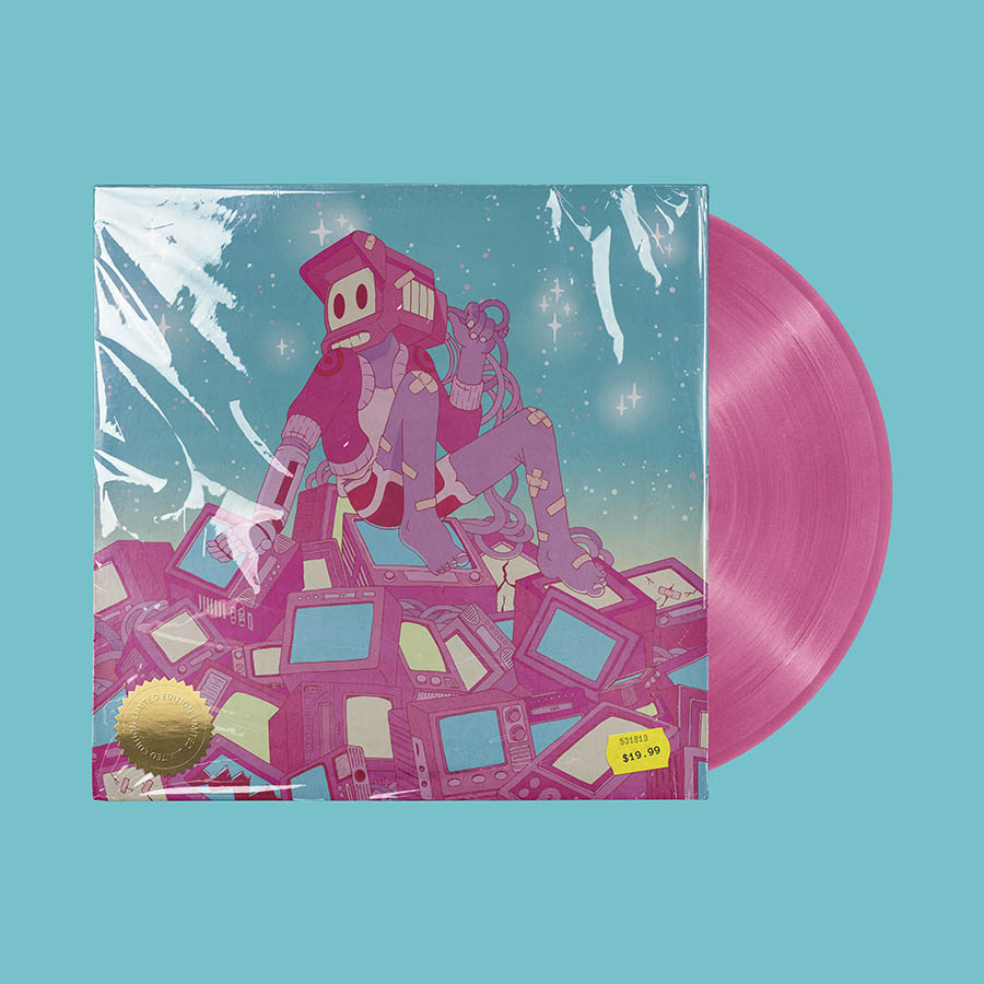
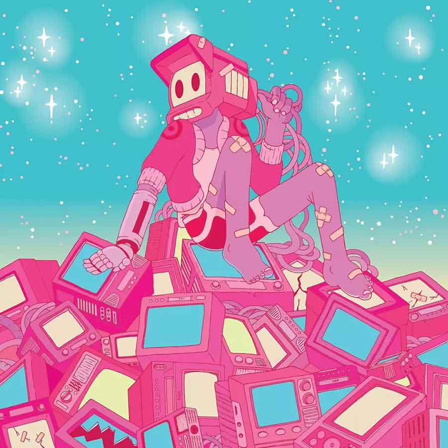
Do you find your audience has a deeper connection with your work once they know more about the ‘why’ behind it? How so?
Yes, especially when I’m creating a piece for someone. I think people really appreciate the time and thought that goes into the piece. It makes it personal and special. When I’m working on my own projects too, I think people enjoy the explanation of who the character is, and why they’re carrying weird and wacky things in their backpack, or what rabbit hole a character has stumbled into. It helps bring a drawing to life.
What challenges did sizing up your work to mural scale present? How about when designing commercially for logos or package design?
Painting the mural was a very different experience from drawing in a small sketchbook. When I started, I actually had no idea how I was going to do it. I was lucky enough to make friends with a local artist who is an experienced mural artist. She was very kind to share some great tips and advice, and she really helped me wrap my head around it. It was a bit overwhelming at first, having such a big project, but once I had a plan, it was much easier to manage, and it ended up being a really fun project to work on.
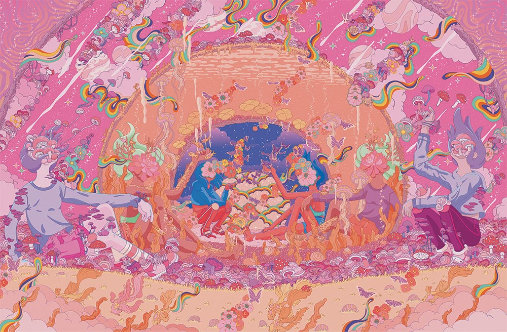
Materials: Vector (Illustrator & Photoshop)
When I’m working on my own projects too, I think people enjoy the explanation of who the character is, and why they’re carrying weird and wacky things in their backpack, or what rabbit hole a character has stumbled into. It helps bring a drawing to life.
Finally, what are you currently focused on creatively? Are there any exciting projects or exhibitions coming up that you’d like to share with our readers?
I’ve decided that I want to pursue character design and storyboarding with my illustrations. I think with my eagerness for storytelling, the two go hand in hand. So I’m taking the next steps to get myself there. I’ll be working on a portfolio and focusing on developing a couple of earlier characters I’ve created into short narratives, and familiarizing myself with my new Wacom drawing tablet along the way. Hopefully, I’ll have a solid body of work that I can present to the world and seek out my next adventure.


